Pick Home Fabrics Like A Pro!
A very simple, no-nonsense guide that makes shopping for fabrics easy and fun. Blend intuitive choices with a professional’s recommendation to get the job done!
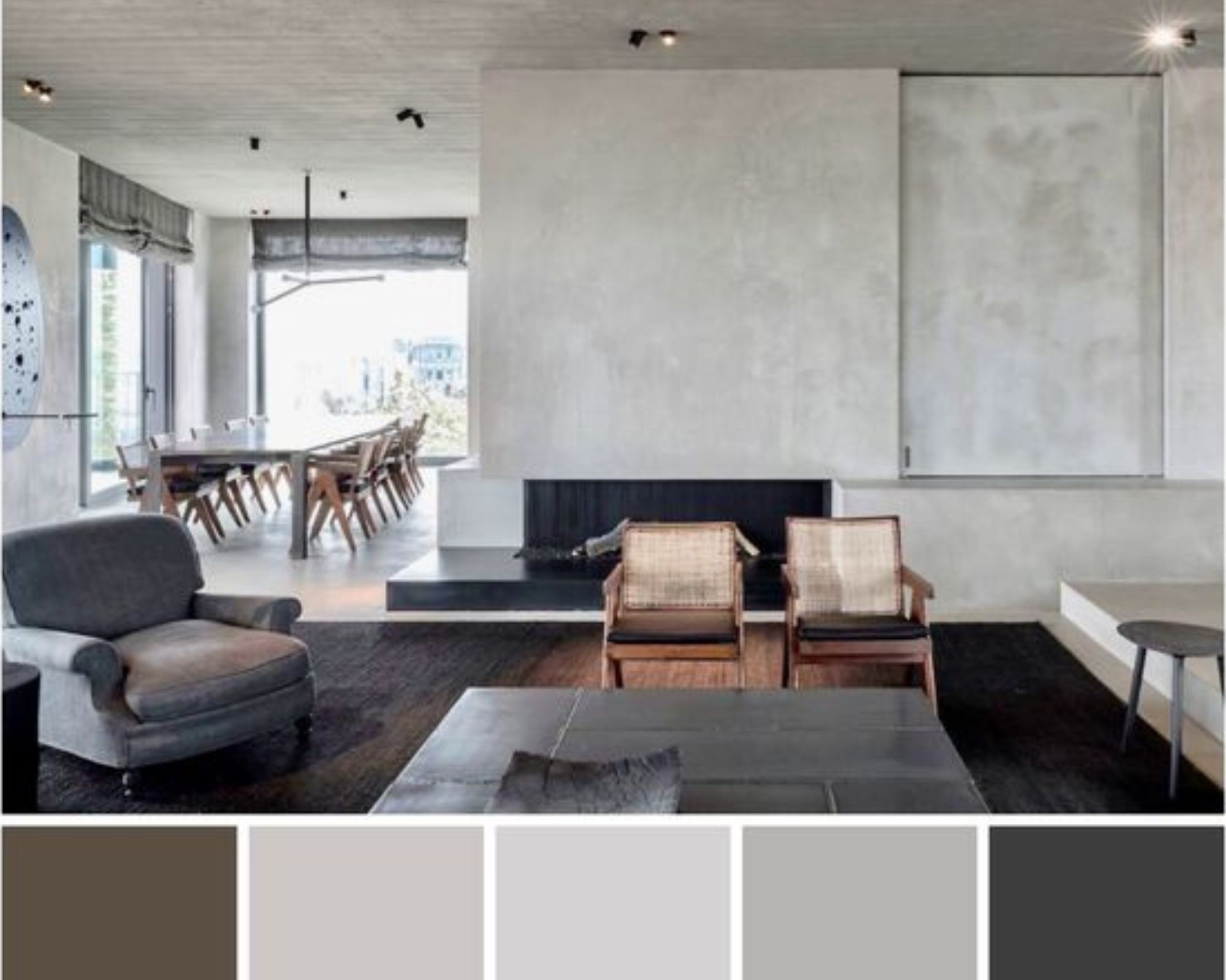
Simply put – pick the fabric first. Not at the end stages of space decoration or styling. Watch how the space opens itself up, revealing beautiful details in nooks and crannies of its natural structure that could have otherwise been missed!
What Do You Need To Shop Fabric For?
The simplest question is usually the most important. Identify the priority requirements:
- Working with a completely ‘naked space,’ and so there have to be fabrics for upholstery, curtains, blinds, or drapes?
- Is it a ‘touch-up,’ something like fresh cushion fabrics to ‘wake up’ that sleepy sofa?
- Is it a 360 degree fabric makeover, but not the first time around?
These questions might be at the risk of stating the obvious. But, we reckon that’s still not as risky as hoarding material that won’t be used, simply because it’s not needed.
The ‘Whys’ Follow Naturally!
Of course they do. Identifying the ‘whats’ makes you wonder about the ‘whys’ of their importance.
“Why is this fabric needed?” Perhaps another case of stating the obvious, but crucial for identifying the difference between a want and a need.
Your ‘whys’ could be:
- Aesthetic:You simply feel your space deserves something beautiful, something that’s delightful to the eye, to the touch, to a comfortable seating experience. Why ever not? Does the need for beauty even need to be explained?
- Functional: Maybe the romance of gorgeous fabric flowing around is easier to follow through with, once the practical functionalities are addressed. Or, perhaps you already know that your ‘love language’ for your space IS functionality. You feel the fabric has to be durable in the face of regular wear and tear and that ITSELF is delightful to the eye, to the touch, and to a comfortable seating experience for you.
- Both approaches to functionality are understandable. What’s important for you to understand, and completely embrace, is the meaning of functionality for you; and when you expect it to start showing itself in the space, through fabrics.
- Both, Aesthetic and Functional: Sometimes, it’s a case of Fabric A fulfilling aesthetic needs and Fabric B fulfilling functional needs. Then, the exercise is to decide which works best for background drapery, daily use upholstery, or frequently squeezed and hugged cushions.
- Quality fabrics are usually aesthetic and functional, together. A transparent conversation with a trusted professional interior decorator or stylist, or with the trained team of an experienced brand, can make the long list and short list process a real breeze.
- Economic: You choose the fabric you choose because it fits the budget. That transparency saves everyone the stress of coming back to square one again and again. Now, in the studio, and in the design or concept space of a seasoned professional, there’s room for various definitions of ‘budget’ and ‘luxe.’
Clarity on personal definition aside, it’s important to ‘fix’ that approach as well. Everyone involved should know whether there is – or isn’t – any scope for splurging, at early or later stages. This, too, saves multiple u-turns back to square one!
Frequency Of Fabric Use
A very intuitive step of the fabric selection process. If you have delicate fabrics with intricate embroidery or embellishments in mind, it’s natural to lean towards the less frequently used, and the more ornamental spaces for them.
Identifying Your Choice of Fabrics
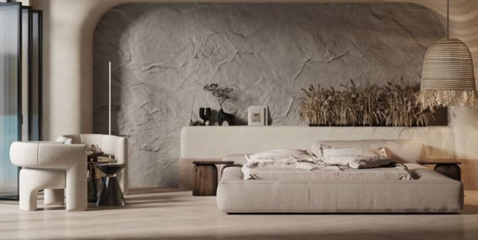
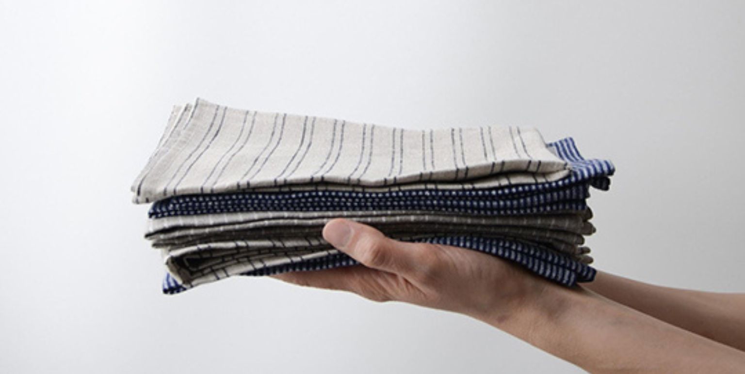
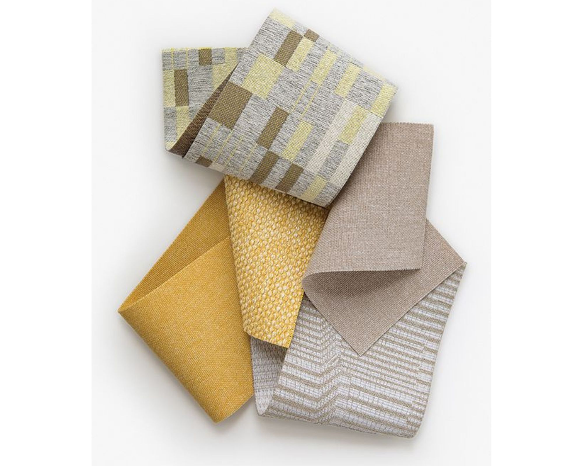
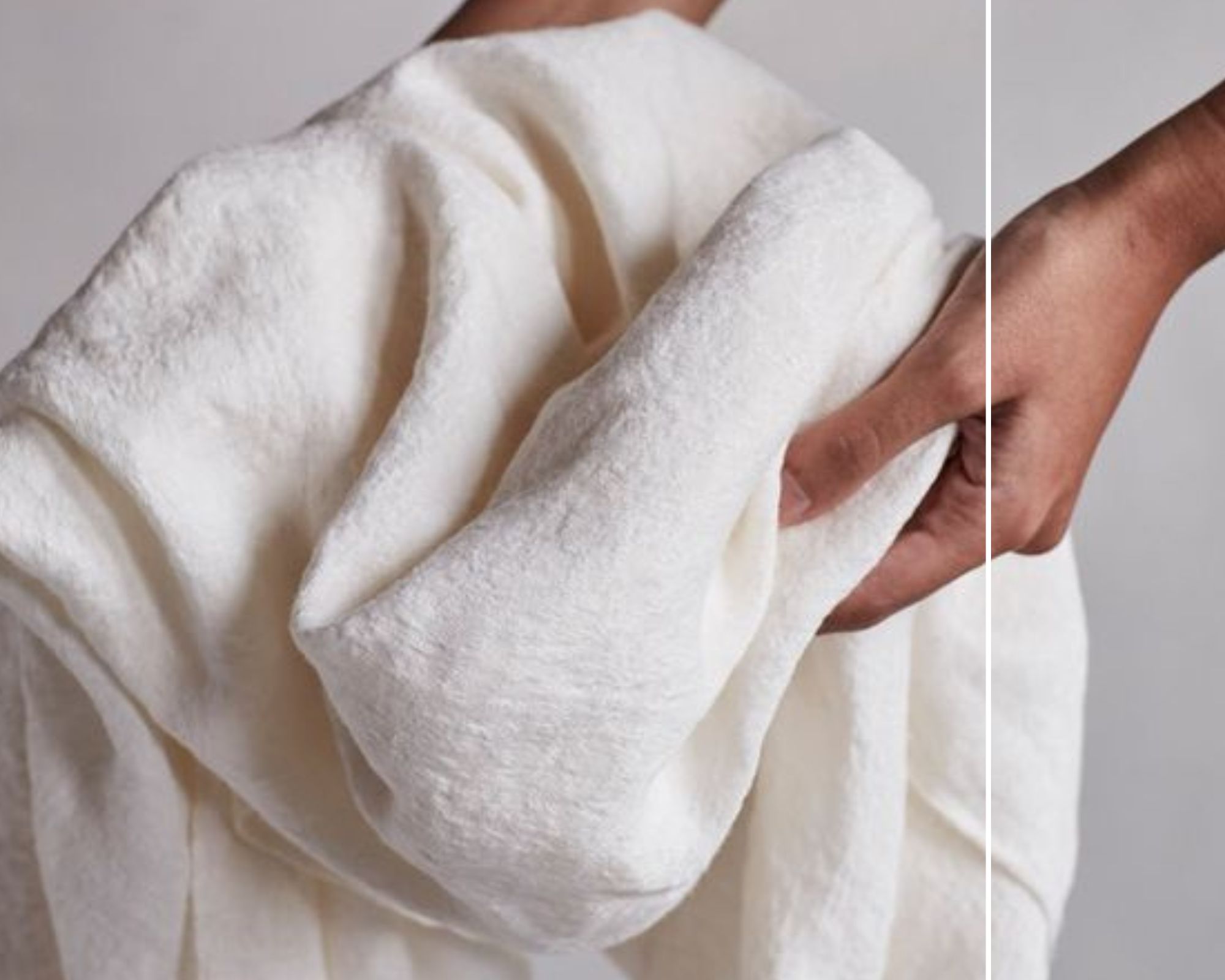
- The touch-feel experience: This is usually that automatic first step to connect with the experience of a fabric. Smooth, even-weave, coarse or marled, and mixed-texture fabrics prompt you to think about personal comfort. That’s personal comfort not just in terms of taste, but in terms of visualising the scale and volume of that fabric. Would this texture look good on absolutely every curtain or furniture? Is it good just for a few cushions here or there?
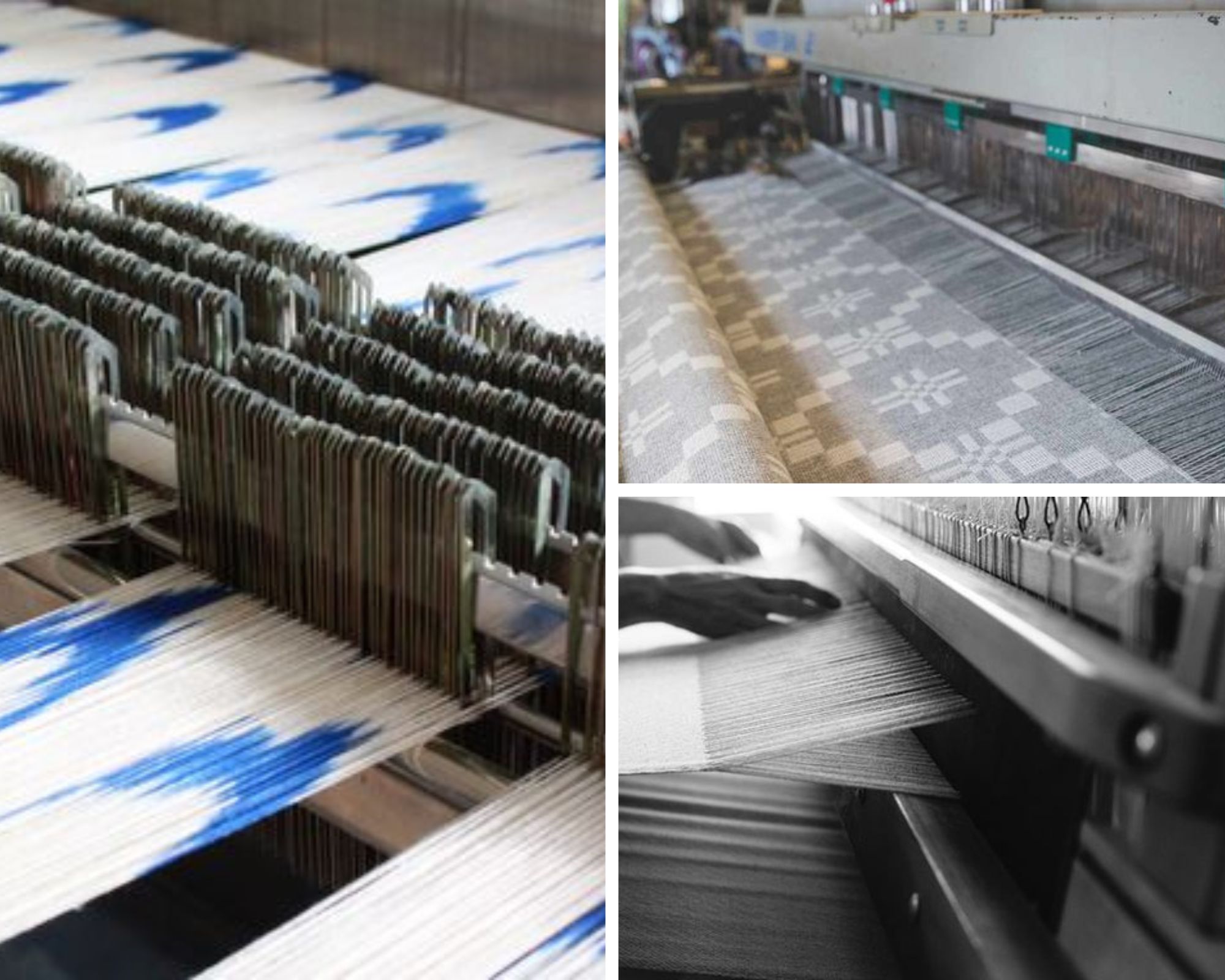
- Checking widths: The fabric’s width is its measurement from one selvedge (the end that keeps the fabric from splitting or fraying) to another. There are standard industry measurements, and asking questions about these before purchasing fabrics will help you get a better understanding of how to use those fabrics most efficiently.
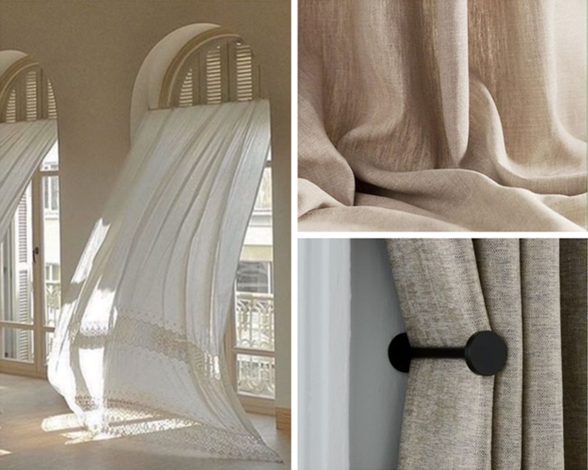
- Checking weight and fall, or stretch/viscosity: The way a fabric falls says something about the way it drapes with its own weight. You come back to functional and/or aesthetic implications here, and you’ll know whether the fall works for you or not, when you see it. A fabric’s stretch or viscosity says something about its natural resistance (or lack thereof!) to being ‘moulded’ this way or that. Some fabrics can be ‘stiff’ in that regard. It makes life difficult for some, for others, it’s easy, simply because the fabric just is what it is!
For weight, you may find that fabrics are usually classified into the easily relatable categories of light/sheer, medium, and heavy.
A conversation with your stylist, designer, retailer or vendor on the technicalities can reveal more information about the way the fabric has been woven, and why.
Lighter ones tend to be used for flowy sheers or curtains. Medium and heavy ones tend to be seen as the long-lasting options for upholstery; seeing as upholstery is not redone too frequently.
However, heavy fabrics may also be used for dramatic and opulent curtains, and medium or light ones for stand-alone accent furniture or plush cushions. Another example of how to harmonise intuitive picks with a professional’s recommendation.
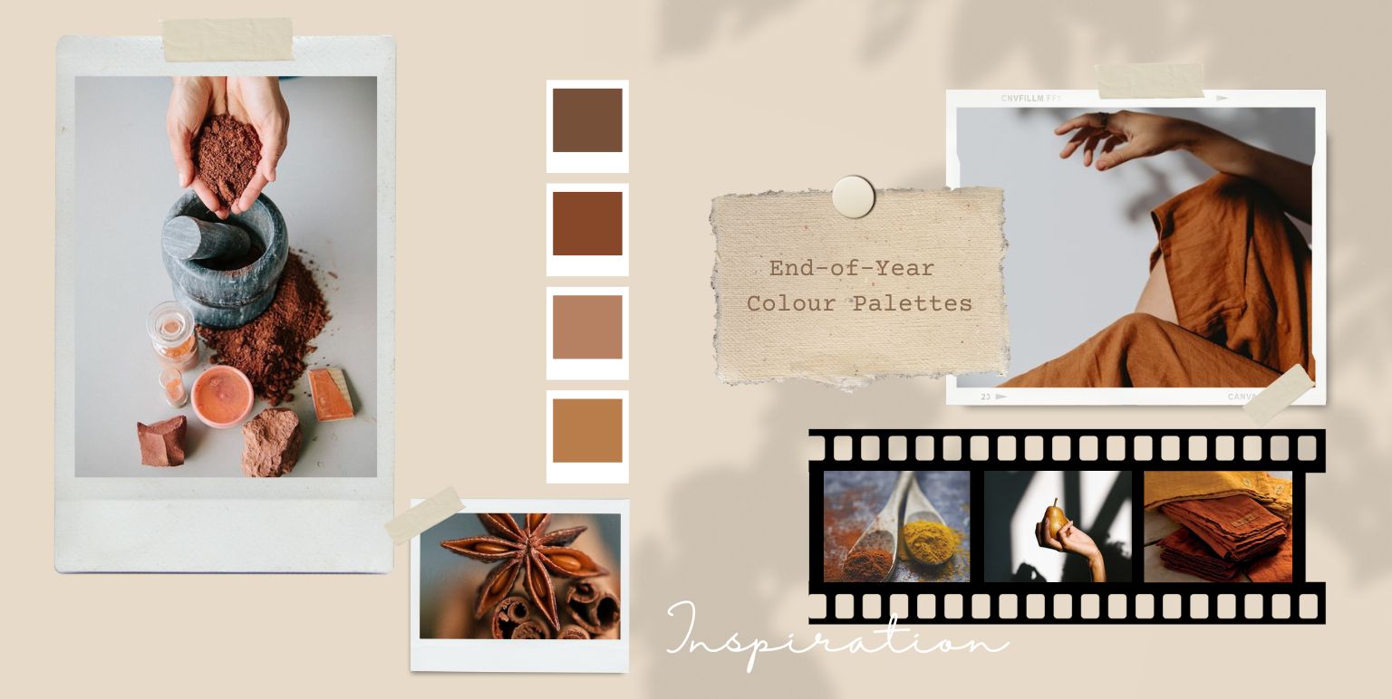
- The colour conundrum: A general rule of thumb dictates that bolder fabric colours do better against natural light, especially if the intensity of light throughout the day isn’t consistent; whereas lighter colours can appear washed out.
Having said that, natural light from different directions (north, south, east, west) have particular qualities, as a result of which they can cast either a warming, or cooling effect on colours. Whether you should worry too much about this or not, depends on the amount and frequency of exposure to natural light from a particular direction, and any shielding – or – obstruction – due to covers or canopies created naturally by trees outside.
Where artificial lights are concerned, it’s worth it to research bulbs that mimic natural light as closely as possible. Otherwise, warmer colours can appear more saturated under particular types of accent lighting and cooler colours can be rather drab. Spot lighting, or track lighting can also cast their own kind of shadows, depending on placements, which can compromise the natural lightness or richness of fabric colour.