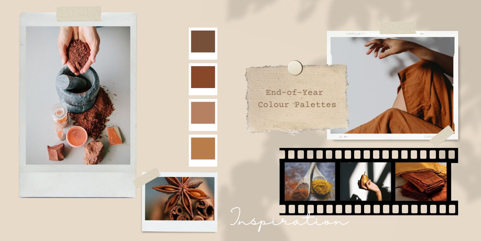

Enchanting End-Of-Year-Colour Palettes To Try
Mystical Indian spices. No-nonsense rustic rusts, or otherworldly molten copper or silver. ‘Magic beans’ that make drinking chocolate and dark coffees, or the colour of the wood that makes your favourite wizard’s wand.
Biophilia, and the enchanted forest inspirations are here to stay – they’ve been here longer than us humans, haven’t they? If colours express emotions and moods, then, there’s something magical about capturing Nature’s cosy restfulness, as we inch towards the end of the year.
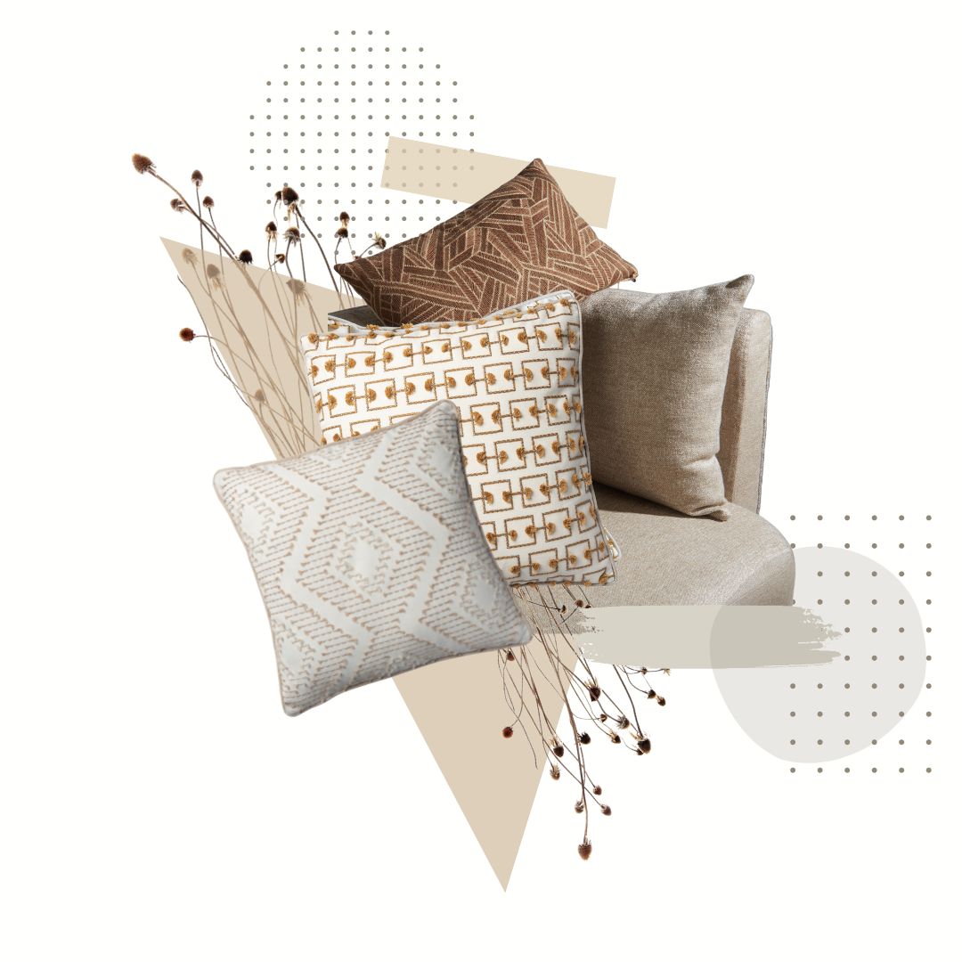
SIMPLIFYING COLOUR PALETTES WITH MODERN MINIMALISM
Does making a mood board for colour themes feel stressful? If yes, that’s possibly because the visual of the final moodboard is delightful, but often, shortlisting tasteful colours that go with each other isn’t as easy as it sounds. With a modern minimalist approach, a monochromatic palette is the answer. Simply put, this means picking one dominant colour, and making a palette out that colour’s own light-medium-dark hues, or shades.
Of course, we feel you – it’s not always feasible or convenient to give living spaces a makeover, in colours that reflect the changing moods of changing seasons. Such projects have a way of feeling extra stressful especially at the end of the year.
Having said that – a fresh wave of colour – no matter how small is, comparatively, one of the most time and cost efficient ways to do it.
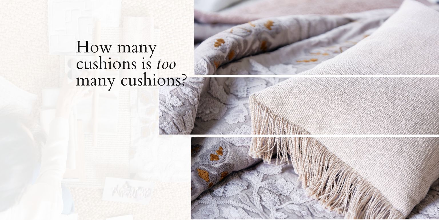
Example: a few cushions here, a change of curtains there, feels more doable, than, say, flooring, or wallpapering, or even upholstery.
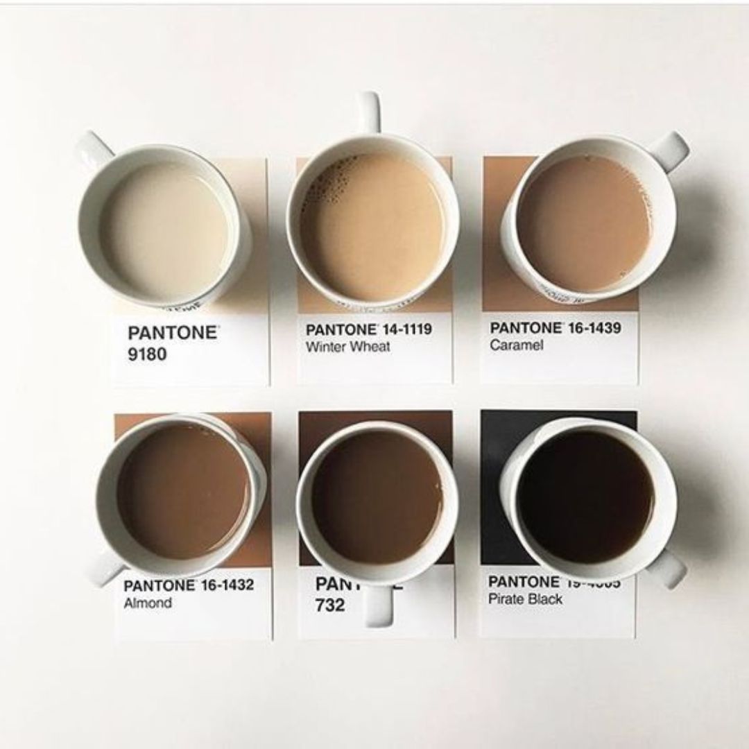
BROWN WEARS THE CROWN
‘Homecoming’ is at the heart of many end-of-year themes: professional, or personal. Woody browns, sandy browns, and coffee browns have always been loved for the fact that they don’t impose themselves on aesthetics. They provide a great foundation, and make for sophisticated layers. Now, all kinds of browns are loved even more because of that feeling of safe, anchored grounding.
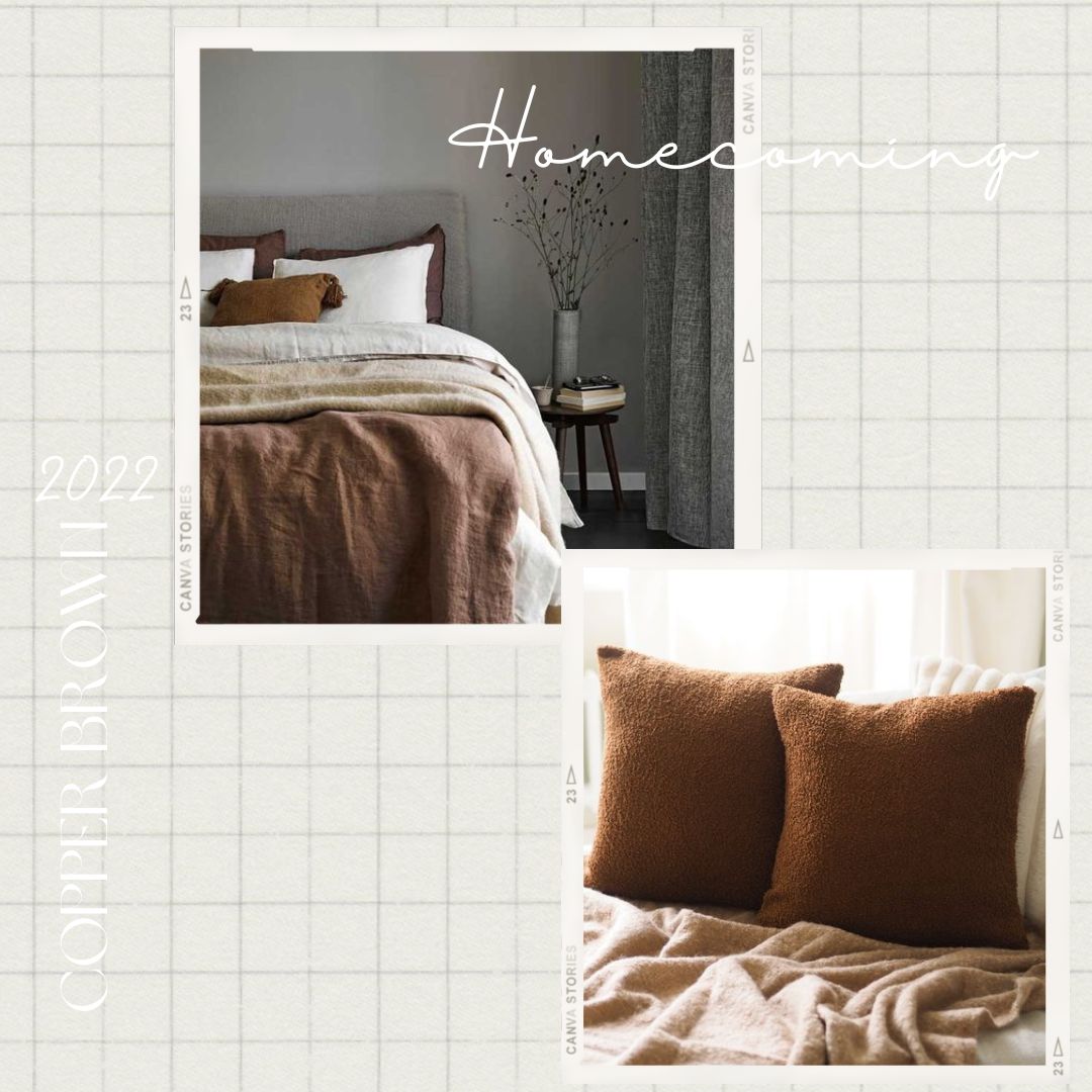
A copper-brown accent wall can be a real game changer, if you can identify a paints supplier for that perfect balance of sumptuous depth, and shine, that won’t cheapen the desired ‘subtle sparkle’ effect. In general, browns have always been popular because of their ability to make expansive rooms feel cosy, and compact rooms feel like there’s more depth to them.
As an option in upholstery fabrics, it’s a question of balance. You want to pick a shade of brown that feels protective without being dense or drab.
When looking at brown for curtains, consider also the colour of the surrounding walls; any preference for layering those brown curtains with sheers; and the amount of light the natural weight of the brown fabric will – or won’t – allow in.
GETTING FESTIVE WITH THE INDIAN SPICE PALETTE
It’s that time of year when Indian homes begin getting ‘dressed up’ for a stream of festivities – the scale and size is completely a matter of personal preference, and personal values. There are weddings, events before and after weddings. There are cards parties, housewarming parties, and general holiday merriment.
Warm and fragrant Indian spices don’t just rule the Indian kitchens in the festive season. They’re at the heart of spiritual rituals, too – revered for their powers to maintain auspicious, pure energies and or dispel the effects of the evil eye.
Turmeric yellow, or turmeric-inspired ochre is lovely. Eye-catching, but mellow, and bright if required, without being garish.
Mustard-coriander-and nutmeg browns play with natural light quite effortlessly. Their lightness doesn’t feel too washed out, and you can feel more confident applying them on a larger scale.
Chilli red is a fantastic monochromatic ‘pop’ to suit the festive mood. Clove or cinnamon brown translate their richness beautifully into velvet or jacquard fabrics.
Sage was quite the rage – and we loved it. Not likely to get old anytime soon, but we find that cardamom is a fresh, more textured take on it – a new face of pastel-powdery greens .
FLOWERS AND FOLIAGE OF THE FOREST FLOOR
Ah, the determination to complete a hiking trail in the forest – only to be distracted by that fun activity – making leaf angels with your body! Folks have been known to report that it’s not just fun, but deeply therapeutic to connect with the natural floor of an old, old forest in this manner.
The forest floor isn’t just abundant in green-orange-brown-yellow leaves and twigs. You can find some beautiful flowers, stones, and forest fruits too – not to mention the feather of a familiar, or even a never-seen-before bird.
Then there’s another element – not under your feet, but up above, and very much part of the forest floor aesthetic – simply because it’s so hard to ignore!
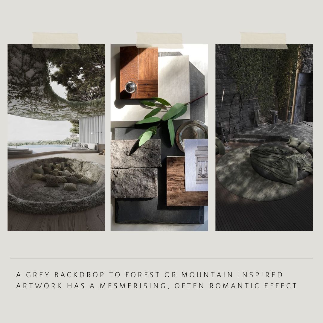
Think misty grey-blue, molten skies above the highest trees – is it morning, or evening? By the time we’ve hit the ‘last lap’ of the year, we really can’t tell, and it doesn’t matter. It just has to feel like a light, but feel-good fuzzy cocoon.
Greys are often perceived as ‘cold,’ and thus avoided in the cooler seasons. It’s down to the particular shade of grey, to be honest.
Darker greys do just fine on their own. Draped over contoured furniture , they can feel as warm and cosy as any other colour, because their meditative neutrality draws you in, and wraps around you. In moderation, lighter greys are very soothing when layered with blush or lilac pastels. They feel very festive with browns, and rather healing, with greys.
A grey backdrop to forest or mountain inspired artwork has a mesmerising, often romantic effect. Use for cushions, or standalone furniture upholstery. If you like it for pleated drapes – why not? Through the pleated effect, it’ll feel like you’re ‘flying past’ a forest! Taking inspiration from this, you can have a lot of fun looking for printed and patterned fabrics – a mix of flower-foliage motifs, with, or without columns, grids, or meshes.
If you prefer larger-than-life motifs, but still want to go the modern minimalist way, then let that motif be the only detail.