Guide For Styling With Cushions
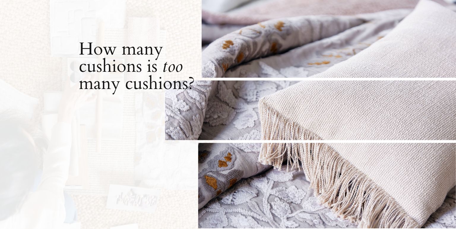
But first: how many cushions is too many cushions? From a modern minimalism perspective, it’s about quantity that gives quality. Your cushions are beautiful on their own, but from the POV of finishing touches, you want to choose the ones that make a space come alive.
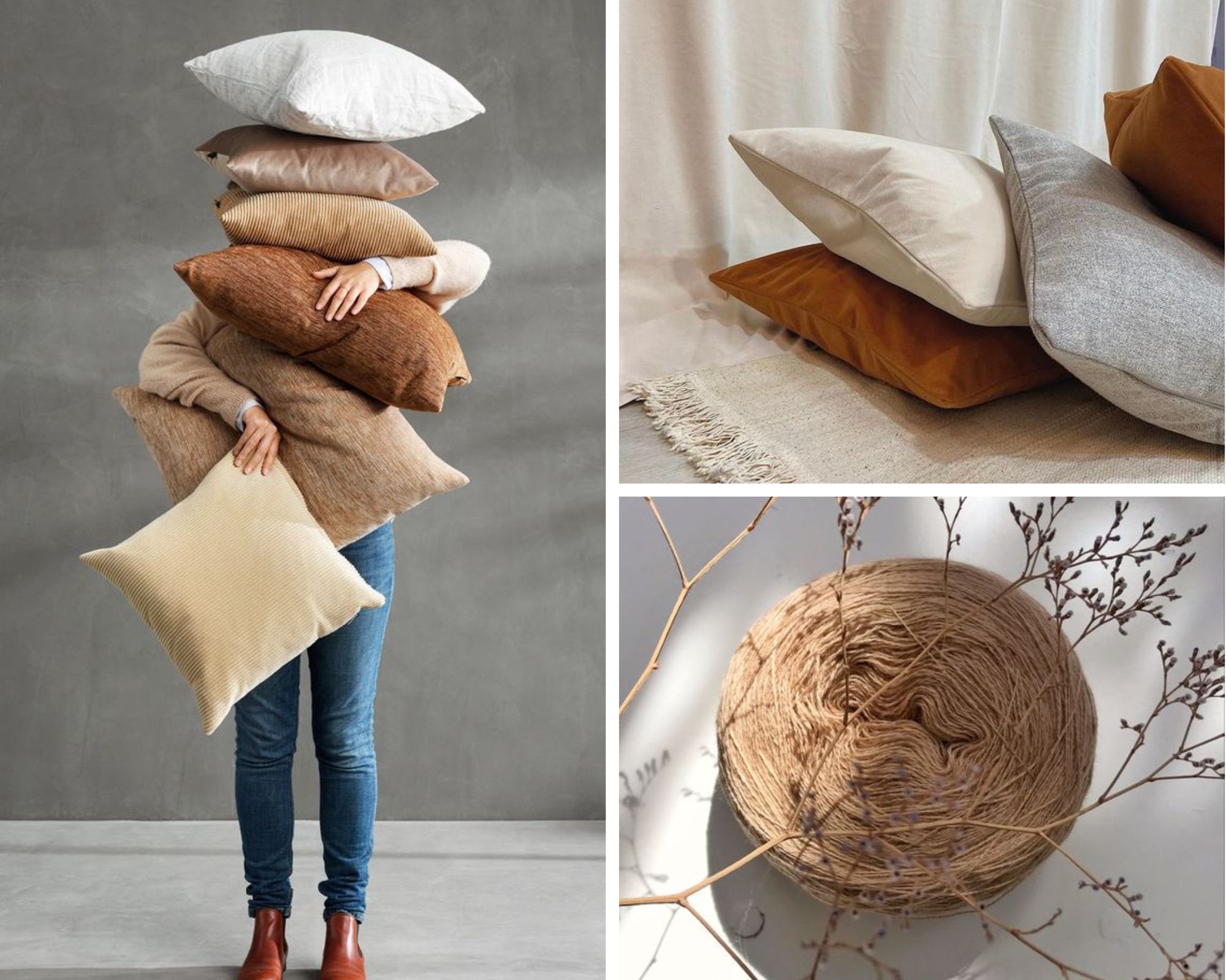
CUSHION COMPATIBILITY CHECK
A round pizza in a square box – fits beautifully, makes complete sense, we’ve never questioned it. Think of this (rather quirky?) example when you’re trying to find the right cushion-furniture match.
In other words, trust the process of experimental cushion styling. This is your space. It makes sense that intuitive matching should be one of the first ways forward.
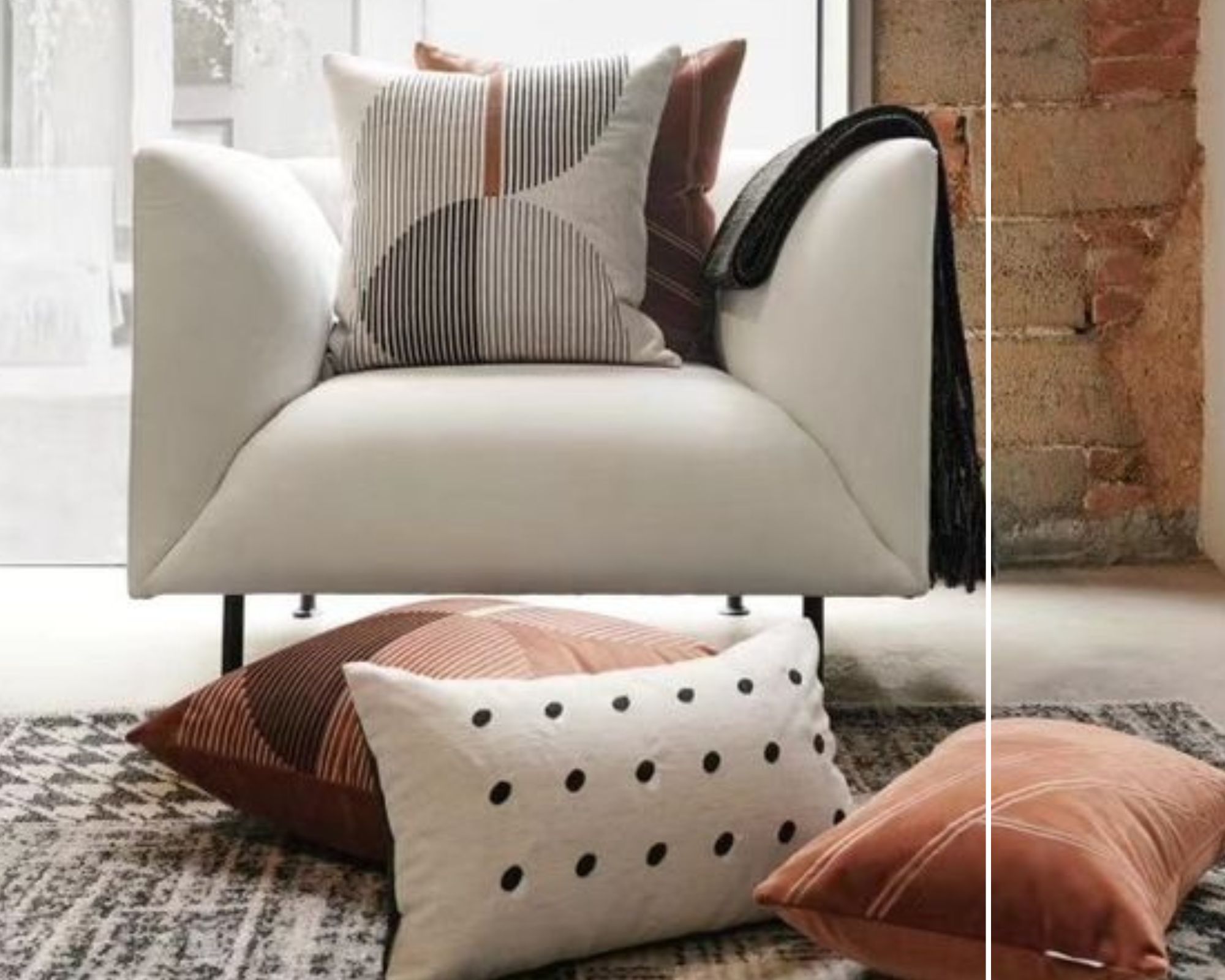
STILL, IF YOU’D LIKE A GENERAL RULE OF THUMB…..
Ask yourself
- Are the cushions functional, i.e for back support? Are they simply aesthetic?
- I’ve decided the shape of my cushions – but how BIG or SMALL is that shape?
For two or two and a half, seaters, you can try
- One statement cushion, matching it with a ‘twin.’
- A pair of contrast colour or contrast texture cushions.
For three or three and a half and larger seaters, you can try
- Several cushions that are in the same hues as the upholstery fabric. This tone and tone effect can be ‘cut’ by one contrast-effect cushion.
- A mix of block colour, large, and small pattern cushions.
Start from the outside in: basically, that’s positioning your cushions from the edge, and inching closer towards the centre.
In the case of a plump sofa, you may be tempted to style it with several, equally sumptuously plump cushions. Less is more here, because it’s about too many cushions on an already cushion-y sofa.
In the case of a more architectural sofa, you can try adding more cushions than you normally would, to balance out the angular effect.
LAYERING BY COLOUR
A helpful first step is to figure out if you want:
- out-and-out contrasts;
- distinct, but harmonious colour blocking; or
- singular tone on tone play.
Look around the space as a whole. After all, the cushions aren’t just part of the sofa-lounge chair landscape, but the landscape of the whole room itself.
What are the dominant colour stories for the walls, ceiling, surrounding cabinetry, plants, and other decorative accessories? How – or – where do your chosen cushions sit against these?
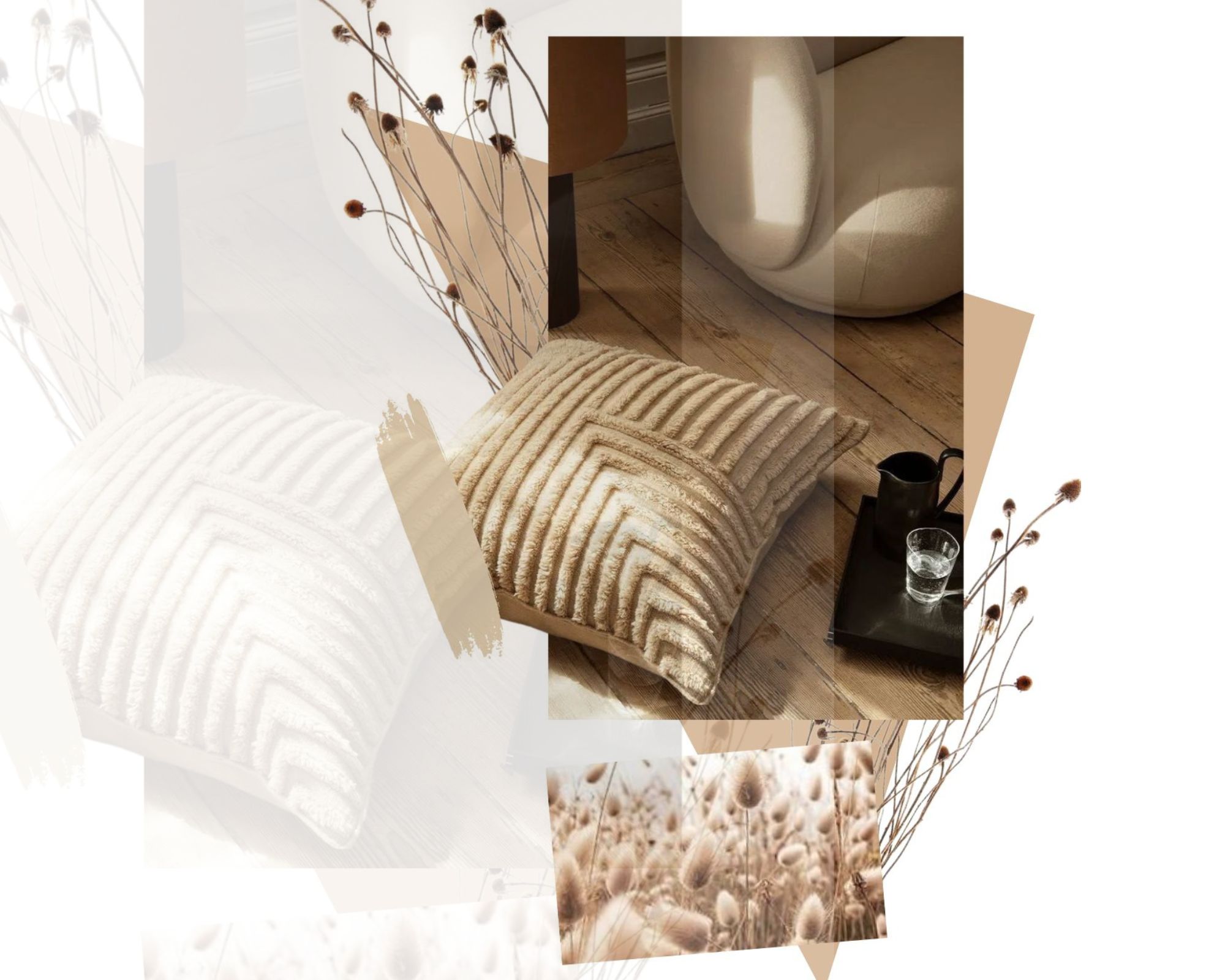
There’s the all-white-everything approach, for instance. Many takers out there for white-only cushions on white-only upholstery.
Pastels against the classic tonal trio of black, white, grey make for soothing contrasts.
Colours closer to the pop or jewel end of the spectrum have a more dramatic effect, but can still feel peaceful if the contrast is neat.
Choosing progressive hues – such as moss green over sage green, or sea foam against powder blue – makes layering more organised, simply because it’s at least anchored in the same colour palette.
THE EFFECT OF LIGHTING
How is your furniture positioned with respect to natural lighting received in a particular space? Do overhead lights, track lights, or lamps on side tables tend to ‘spotlight’ your cushions?
Important questions to mull over, because the effect of lighting can actually influence your colour choices for cushions.
Light can amplify the inherent beauty of some colours, but can create a ‘bleached’ or ‘washed out’ effect on others.
THE PATTERN-TEXTURE FIXATION IS HERE TO STAY
Here, let’s take a break from the sofas and focus on the accent chairs, or lounge chairs.
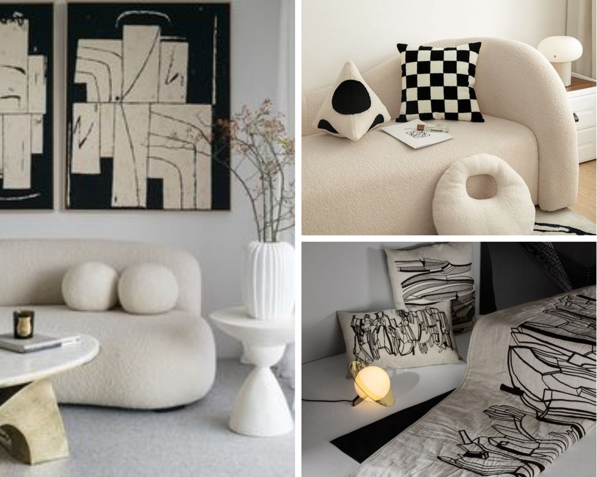
Stand-alone chairs are obviously more compact in terms of the space for ‘sinking in.’ Overdoing it with patterns can actually take away from the visual impact, or visual suggestion of how deep and cosy a chair is.
Patterned cushions on more neutral upholstery fabric – or vice versa – are striking.
A pattern on pattern approach can work well, as long as there are some common details in the themes that keeps them connected.
For modern minimalist cohesiveness, the scale and size of the pattern details, as well as the colour palette of the fabric base should be in harmony with each other.
Textures on cushions are created through the inherent quality of warps and weaves, embroideries or embellishments, hand-painted or digitally embossed elements, and add-ons like fringes.
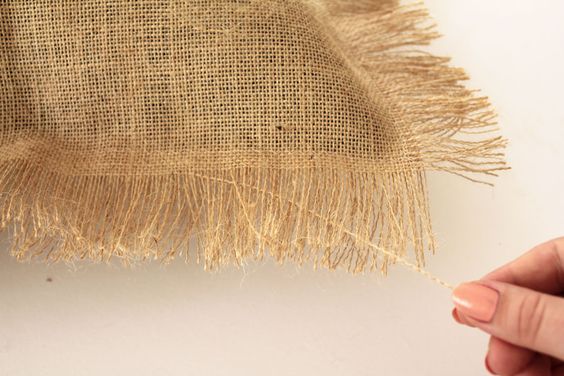
They’ve been added to do the talking, so it’s probably best to let such cushions do so, on their own, or to style them with block colour cushions and tonal upholstery.
DON’T LET THIS MYTH INFLUENCE YOU
The cushion chop- or the dent made in a fluffed up cushion – isn’t required to create that lived-in look and feel. There’s nothing wrong with trying it, especially if the cushion is sturdy enough to hold the dent. But, it’s not crucial.
Focus on getting quality fillers and fabrics that mould themselves to your frequency of usage. Excessive chopping can dull, or even the structural and creative beauty of the cushion.
DON’T FORGET THIS ALL IMPORTANT QUESTION
Is a cushion required at all? Our take on warmth in modern minimalism makes a lot of space on the sofa or accent chair, for a harmonious number of cushions.
But, modern minimalism also respects the natural energy of any space. Some ‘empty’ furniture pieces can feel quite ‘whole,’ and complete, in themselves. If you sense this, leave them be, and enjoy that serenity.
