Guidance for Geometric Interior Design & Décor
Geometric aesthetics never have, and nor will they ever have to try too hard to make a case for their relevance.
Shapes you select are also working with the natural geometric pattern of the structure within which you hope to apply them. If your details have angles, so do the corners of the room in which you hope to fit them. If they have curves, so do the accent pieces that may already be within the room.
So then, trying to find synergy across them all – and then according to single geometric, or geometric pattern options – can be fun, but also overwhelming.
Pick One Geometric Shape or Category for One Space and Work Around
If geometrics is new territory, then this approach would make planning and execution easier. Even if you’re experienced, sticking to one would be an effortless display of not just confidence, but also clarity of vision.
Circles – perhaps the easiest geometric shape to incorporate with furniture, fabric upholstery, cushions, or as decoratives – infuse a literally ‘bubbly’ vibe in the more informal recreational areas, or the entertainment areas of your living spaces. These include bars, WFH creative studios, or even children’s play rooms.
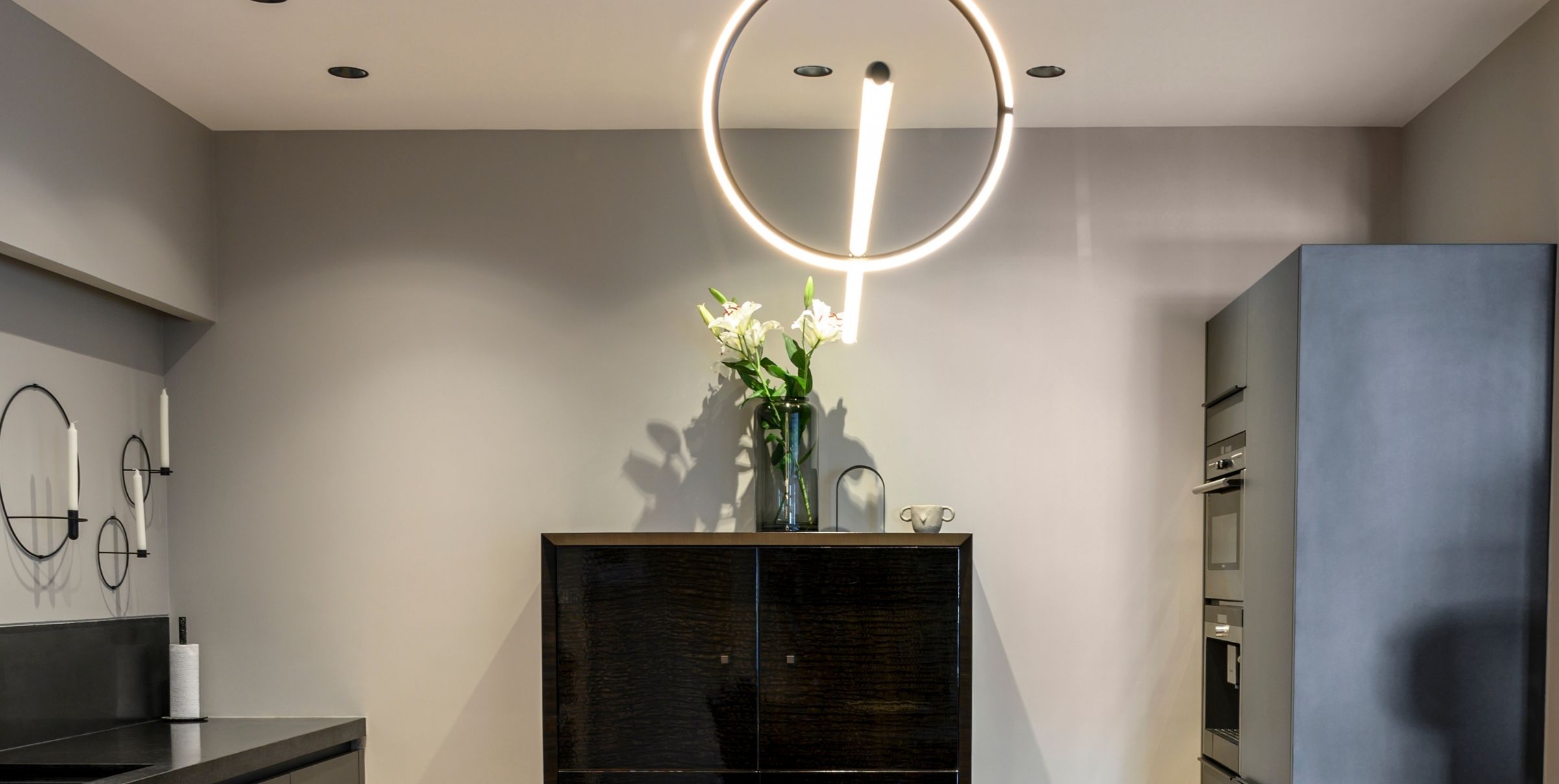
Squares and rectangles are typically seen in the silhouette of seating options, but some people do feel that a very angular pattern, though strong and smart, can also be very ‘harsh’ if running across the landscape, as a theme.
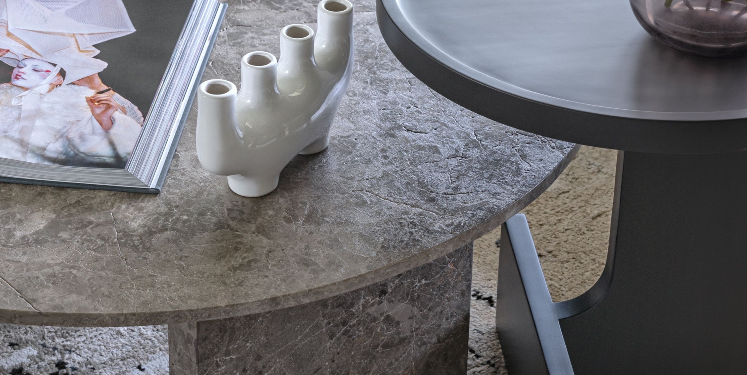
A one-of-a-kind table like might be preferable. This is one of our newer tables, with fluted legs in unique alignments: one horizontal, one vertical.
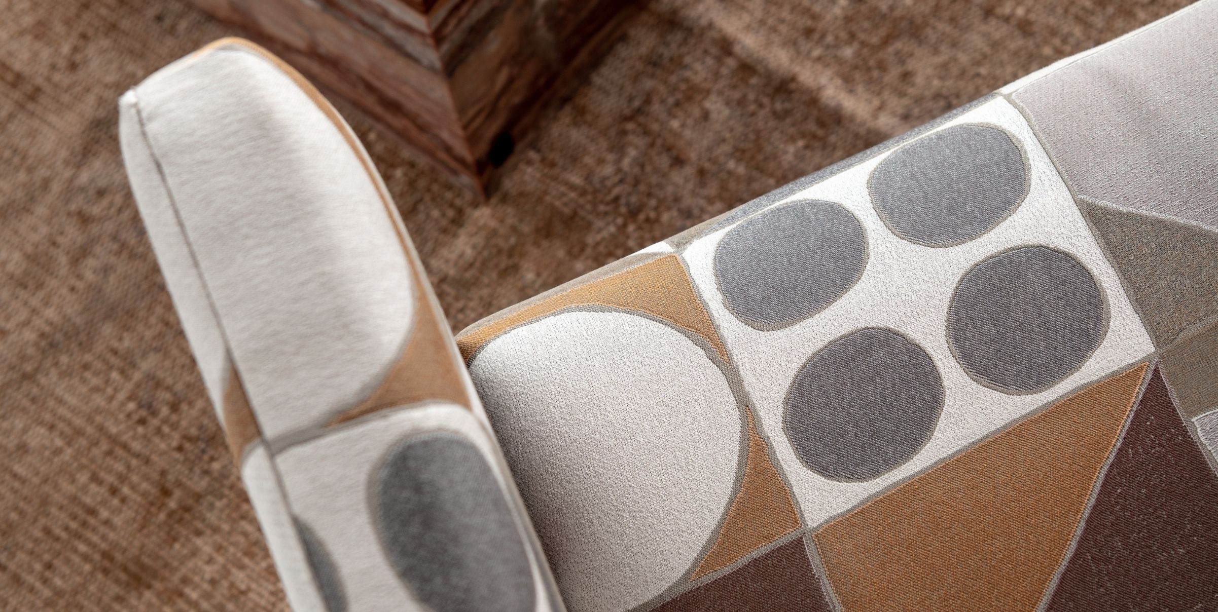
You can also opt for or single, angular silhouette accent chairs which can be moved around to suit different spaces.
Cross-sectional silhouettes, besides triangle and triangle inspired, or diamond shapes are more adventurous, in that they’re distinct as they are. Mixing too many in one area can dissolve each one’s individuality, and their head-turning and eye-catching appeal – pretty much why they’re loved.
Perhaps they’re safer, but no less experimental, as a soft furnishings pattern, or one statement table.
Layering Is Caring
In very simple terms, the ‘perspective’ of a space is defined by its 2-D and 3-D aspects.
If you’d like to work with more than one type of geometric, then understanding perspective is necessary for deciding the scales, sizes and ratios in which to use them.
For consistency, layer angular geometrics with angular geometrics, and the more rounded ones with their exaggerated, elongated versions.
If you want to switch it up a notch and mix and match angular with curvilinear, then start with changing the ‘plane.’
For example, see if you prefer angular details on the walls and curvilinear ones on the floor, or vice versa.
Colour Is Clever
It can be very tempting to scrap a geometric styling layout and start again if you feel you’re losing sight of the final desired look.
Instead of that, look at your colour stories.
If your geometrics are in pastel hues, pair them with slightly darker, mossy or chalky variants of the same. If they’re black and white, either go for shock and awe with a jewel tone injection; or a contrasting classic neutral, such as beige, grey, or pearl-white.
I Can’t Redo My Entire Space Right Now, But I Would Like Some Geometrics….
Relatively easier or comparatively faster ways of infusing the glamour and grace of geometrics include:
Lighting installations
Corner or nested tables
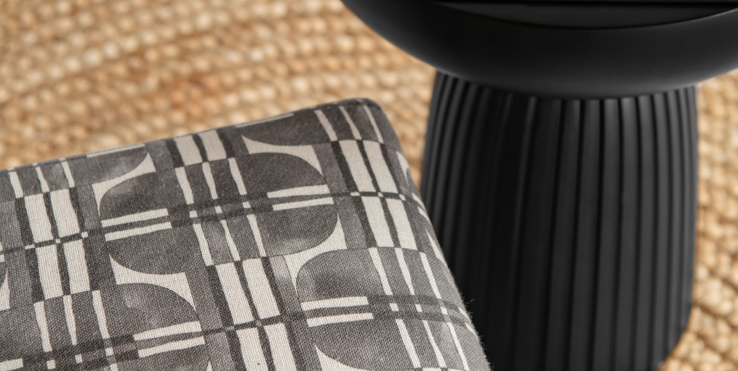
Geometric fabrics if you have curtains, cushions, or solitary sofas in mind for an upholstering upgrade
Geometric shape contemporary rugs.
The simple geometries of ceramic decoratives or tableware.
