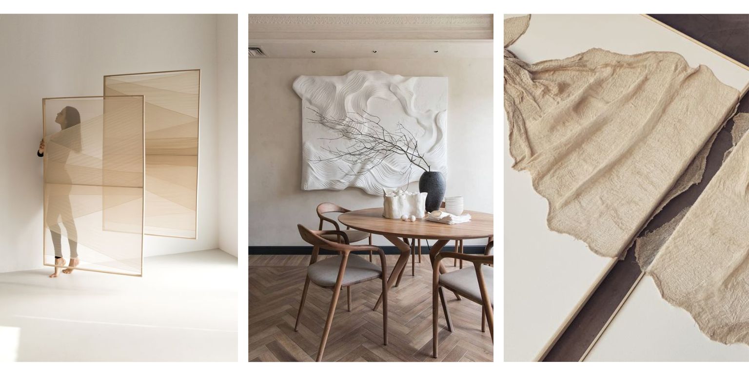

Fresh Colour Palettes For The Vibrant Minimalist
If ‘monochrome’ pertains to a single colour or hue, why can’t it be any other hue except black, white, beige, or grey – and still be minimal?
… LET’S EASE INTO THE IDEA FIRST
We’re making a case for the vibrant monochrome minimalists here. Who are they?
Still lovers of colour palettes focussing on a single hue. It’s just that the monochromes they prefer are ‘chromes’ or ‘chrome palettes’ , with selectively adjusted intensities.
Very simply put, vibrance is a quality that’s applied to the realm of colours. By its definition, it helps colours express what they can do, by increasing or decreasing the saturation in parts where the saturation itself isn’t, within context, at the possible maximum.
The thought of vibrance as a lifestyle choice emerges when we realise that it’s something that literally colours our perception of the world; and then starts expressing itself through things we surround ourselves with.
When we choose a vibrant monochrome palette, we’re saying that we WANT to increase the intensity of a muted colour, while still maintaining its harmonious relationship with other colours – including ones brighter than itself – on the surrounding canvas.
The ‘why?’ of that reveals the relationship between colours and emotions, as it may personally apply to us. This is how we keep falling in love with colours over and over again.
FINE. WHERE’S THE VIBRANT MINIMALISM, THOUGH?
Wherever it’s being used, a vibrant colour or colour palette is still minimalist, if it’s expressing itself as an extension of the existing spatial energy.
That’s one of the fundamental ways in which it’s honouring minimalist philosophy – by making itself at home with the inherent ‘vibe’ of the space, without trying to label what it would’ve-could’ve-should’ve been.
Another way in which a vibrant colour is still minimalist – and we’ve reiterated this one before – is through depth and richness. A vibrant colour can do it effortlessly, without the extra help from supporting elements, without trying to do more on its own. In that ‘downsizing’ and ‘decluttering’ of ways in which to make its presence felt, vibrance can be minimalist.
ER…. A MORE MINIMALIST WAY OF SAYING THAT, THEN?
Lol. Touché.
To be vibrant is not about overshadowing others. It’s about brimming with energy levels that haven’t quite revealed themselves. The attraction is in the perceived potential of those energy levels, and how far they can actually go.
LET’S DO IT!
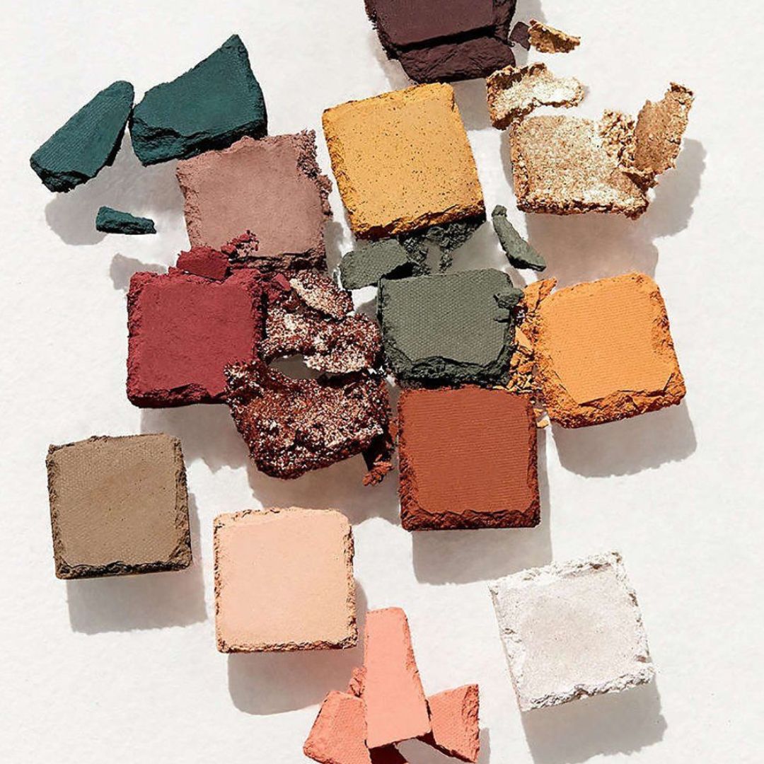
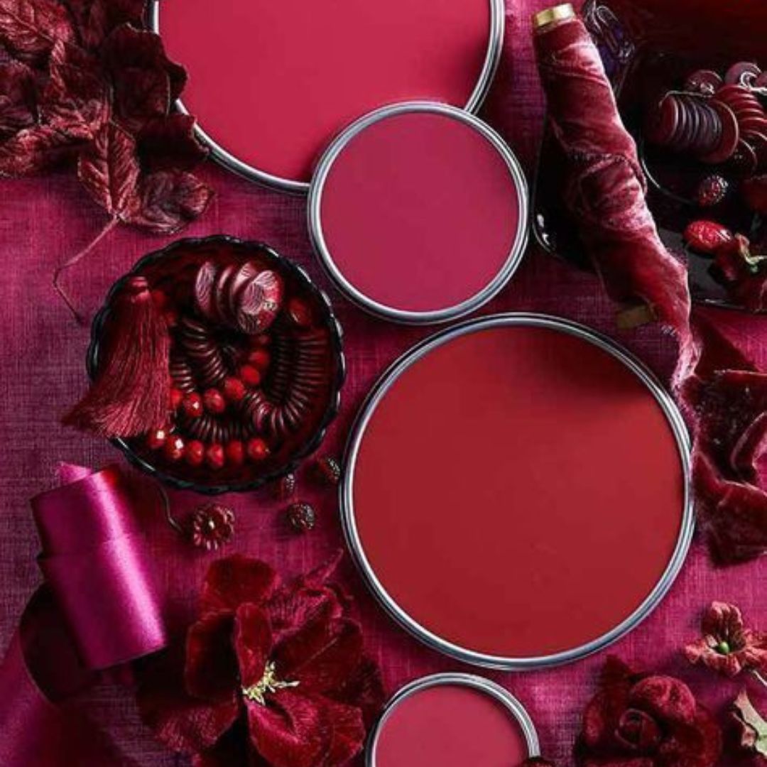
Here’s looking at the vibrant monochrome palettes already making ways this year. We’ve already raised a toast to the Pantone Colour of the Year, Viva Magenta, here.
First, if we want to figure out a vibrant monochrome palette that speaks to us, then a quick recap of colour mixing basics might help.
Primary Colours (of Light): Try Blue,Yellow, Red.
Secondary Colours (of Light): The fun begins. Secondary colours emerge from mixing primary colours. Cyan, Magenta, Yellow.
In a traditionally familiar colour wheel:
- Blue + Yellow = Green
- Red + Yellow = Orange
- Red + Blue = Purple
Tertiary Colours: Really into it at this stage, mixing equal parts primary and secondary colours, or half-full pigment intensities of primary colours.
In the tertiary colour category, are all the romanticised hues born. For example, Chartreuse, when we want to be fancy, about saying ‘Olive Green.’ Then there’s Amber. Violets, and Vermillions.
Even Teal – which is our brand colour, by the way. And, yes, Magenta.
CHOOSE YOUR VIBRANT MINIMALISM!
Just 3 months into 2023 at the time of writing this, and already spoilt for choice when it comes to vibrant monochromes. Feels like ‘eternal spring!’
How do we go about the palettes? Let’s go back to basics again. Let’s do…. the elements (of Nature.)
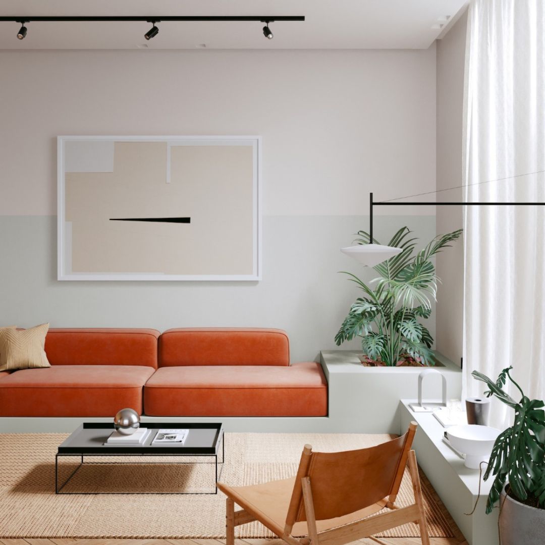
FIRE AND EARTH:
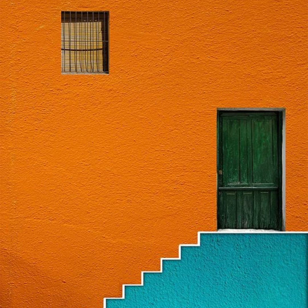
Inspired by the power and vitality, grit and grounding of these foundational elements, in 2023, we hope to see a surge of ‘Sun-Like’ Red and Orange; besides Amber, Ochre, Mustard, and Berry.
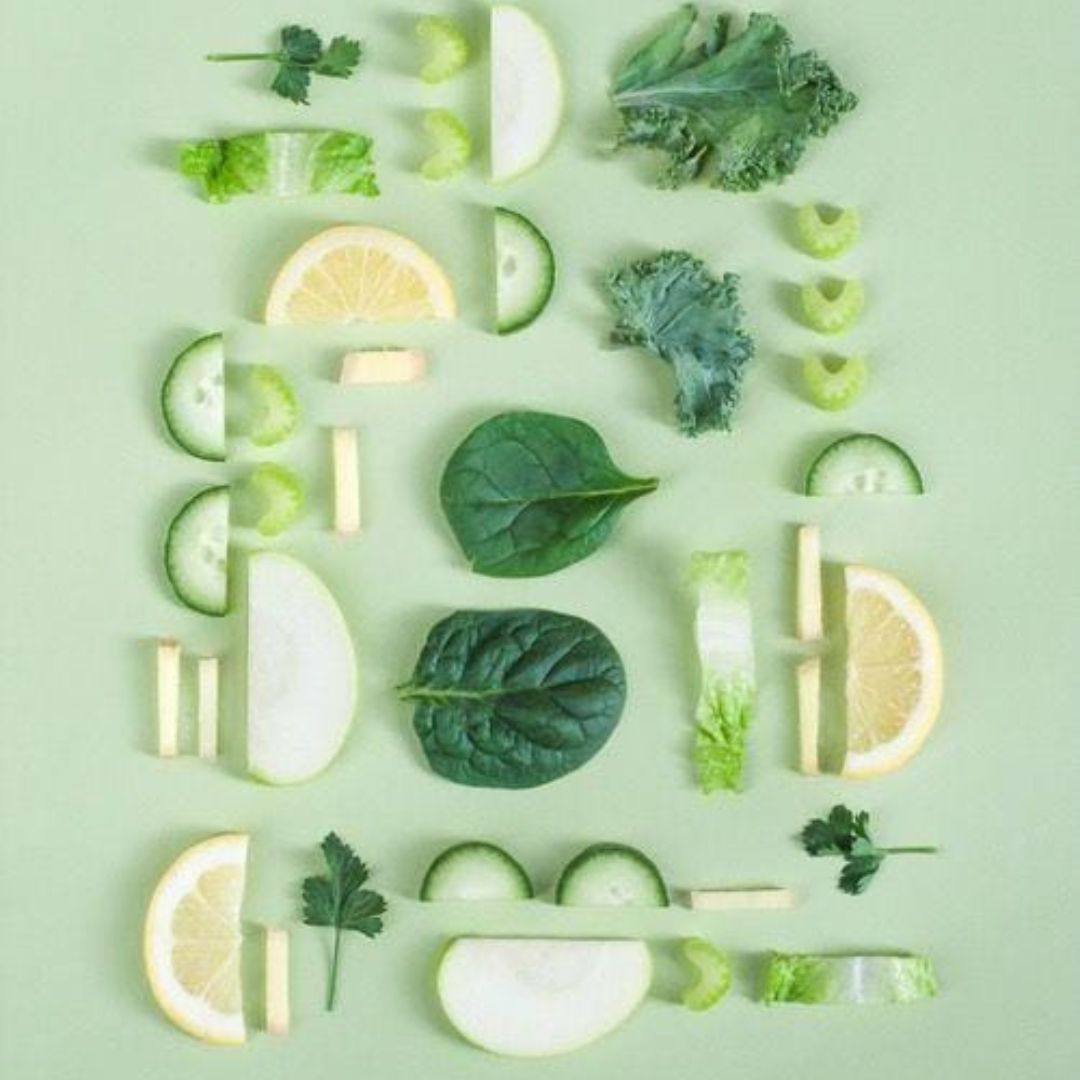
Of late, Sage Green has kept the spotlight scooped up and swept for itself. 2023 takes an interesting turn, with forest-y Moss Green meeting its jewel-tone counterpart, Emerald. On the other hand, yes, of course, Chartreuse, and other Greens of Spring-Summer,like Light Jade, Lime and Avocado. While Mint and Pistachio qualify, refresh the idea by thinking about your favourite memories involving a swimming pool, or river, or ocean. What was that green, in the blue?
WATER AND AIR:
Powdery Blues are still topping the list – infused with the, yes you got it, vibrance – of a Cornflower, or Azure, and Cerulean Blue.
Jewel tones – like Persian Blue, Egyptian Blue and Lapis, or even Peacock Blue, are being used increasingly on their own, or paired with Ochre-Mustards, and Oranges.
Capturing the mystical, shape-shifting quality of Air, 2023 also brings a renewed focus on metallic tinges, inspired by Opal and Pearl White, or Storm Grey and Arctic Blue combinations.
A NOTE ON ‘TRANSCENDENTAL TONES’
Ancient precursors to our modern sciences – such as Alchemy is to Chemistry – indicate ‘Aether’ or ‘Quintessence’ as an element beyond the four that we know. Closer home, our own ancient Indian scriptures call it Akasa – but this is more in the larger ‘cosmic origins’ sense, than just ‘sky’ as we refer to it in daily conversation.
Aether-Akasa-Quintessence is all-wise. All-encompassing, all-knowing. It just is. May seem still and empty, but deceptively so, for it can become everything we can imagine, and beyond.
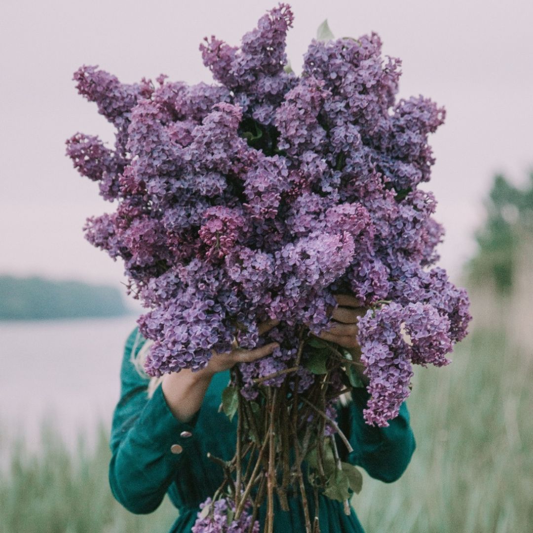
Of the shades of purple associated with such ‘old and high wisdom,’ – also seen in ancient Energy Healing depictions and theories of Chakra Healing – the ones that really stand out are Amethyst, Lilac-Lavender and Violet.
A special mention amongst these transcendental tones, for Blush. As close to Rose, or Beige as you’d like your type of blush tone to be. Blended, or layered, with, say, a Periwinkle, with vibrance adjusted as high-low as preferred