Do The Colours Of Your Living Spaces Speak For You?
Colour symbolism, colour psychology – is this really a thing when it comes to interior spaces? Or any spaces? Yes, indeed! It has been, even before we knew what to call it, because our emotions, and emotional memories ‘colour’ our spaces even when we don’t allow it to happen consciously.
THE CONNECTION BETWEEN COLOURS AND EMOTIONS
Goodness, the Physics, Chemistry, Biology of it all!
Very nuanced, and we can appreciate that by remembering two fundamentals.
Briefly as possible, without discounting how deep it can really get, these are as follows:
First, we remember what we were taught about what colours really are, to begin with.
Is that coffee brown? Brown is what we see because all photons of energy that aren’t in ‘the wavelength of brown’ have been absorbed. Brown is visible, because brown has been reflected
back to us, instead of being absorbed.
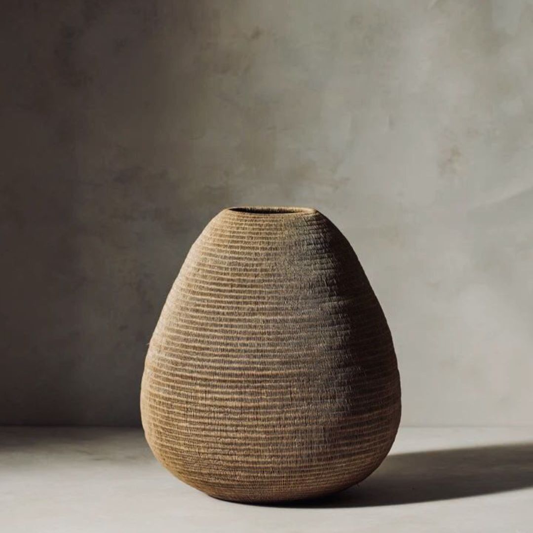
Second, human biochemistry responds to the inherent ‘warmth’ or ‘coolness’ of colors – their magnetic energy signature.
That response becomes emotional when it weaves together primal instinct, memories, and socio-cultural programming that is so internalized and ingrained, that over the years, it’s shaped our personality, our likes and dislikes. This is why we ‘feel’ different things in rooms of different colors.
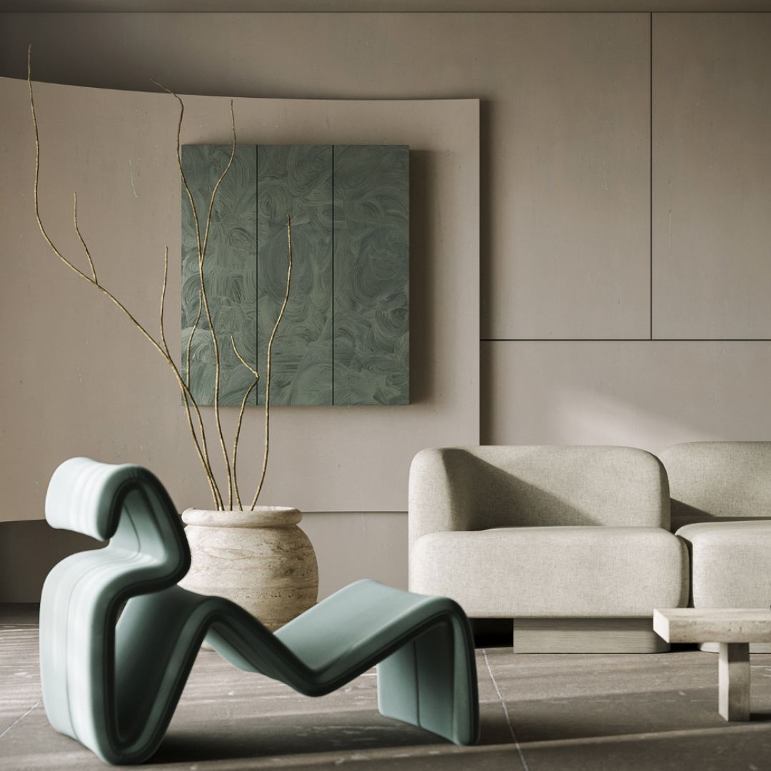
What’s wrong with a red bathroom, a polka dotted parlour, a black bedroom? Nothing. Each is a ‘yay!’ or a ‘nay!’ for different people, often, simply because of how they can make people ‘feel.’
COLOURS, THEN ARE COMMUNICATION TOOLS
Indeed, they are. Isn’t the traffic signal an excellent example of this?
The same can be said for the colours we choose for our living spaces, be they dominant or subtle.
Colour wavelengths set their own ‘vibes.’ In this domain, the emotional impact of colours comes down to establishing a characteristic mood someone can slip into everytime they’re in that space, whether they’re the permanent residents of that space or not.
Let’s see what the usual favourites are trying to say.
THE NEUTRALS
Let’s consider Blacks, Whites, Greys, Beiges, and Browns in this category.
Black is known to absorb the most heat – because it basically absorbs all wavelengths of light, reflecting none. No wonder it’s the colour of drama, mystery, intrigue – it holds what makes every other colour unique and attractive all within itself, carrying ‘a little bit of everything.’
White evokes cleanliness, purity, serenity and finds inspiration in ‘sweet surrender.’ Many colours stand for peace, although human collective consciousness is united in its ability to identify white amongst the foremost colours of peace.
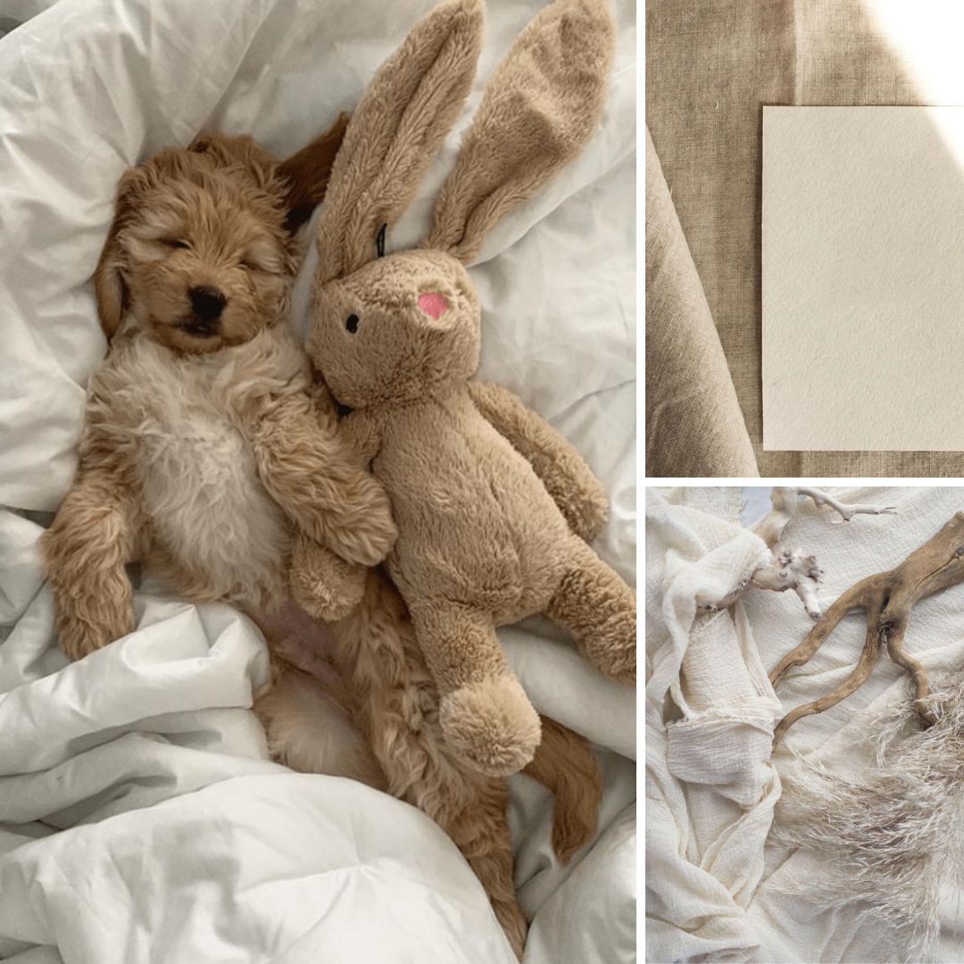
Greys say that the space is unassuming, accommodating, and has all the time, space, and freedom to offer. In that respect, greys are patient, and feel safe, secure, non-judgmental.
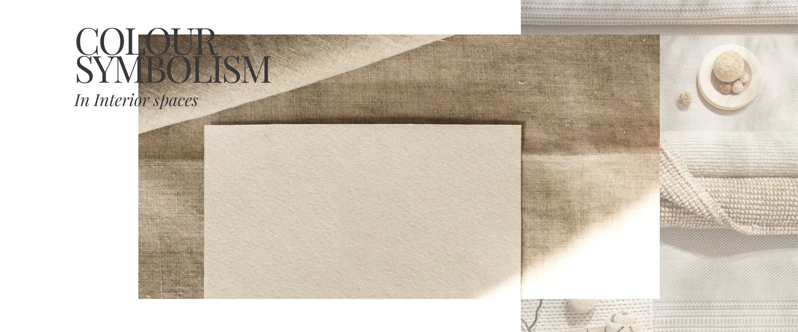
Browns and Beiges are safe and secure too, they evoke the reassuring power and unconditional nourishment of the Earth, after all. Depending on the particular hue, and any textural elements, they can also be ‘gritty,’ conveying a message of taking pride in all things raw, real; and of the character-building to be found in going ‘against the grain.’
GREENS AND BLUES
It’s popularly believed that Blues speak easily to the careful planners, invigorating conversationalists, and the steadfast visionaries. The people who would much prefer that everyone gets along with everyone; that no one leads a collaborative project or discussion feeling like they got the short end of the stick.
They’re also the ones who take the approach of “you didn’t ask, so I didn’t tell,” to conserve their energy in their dealings. Such are the tranquil, and pleasant ways of the truly wise!
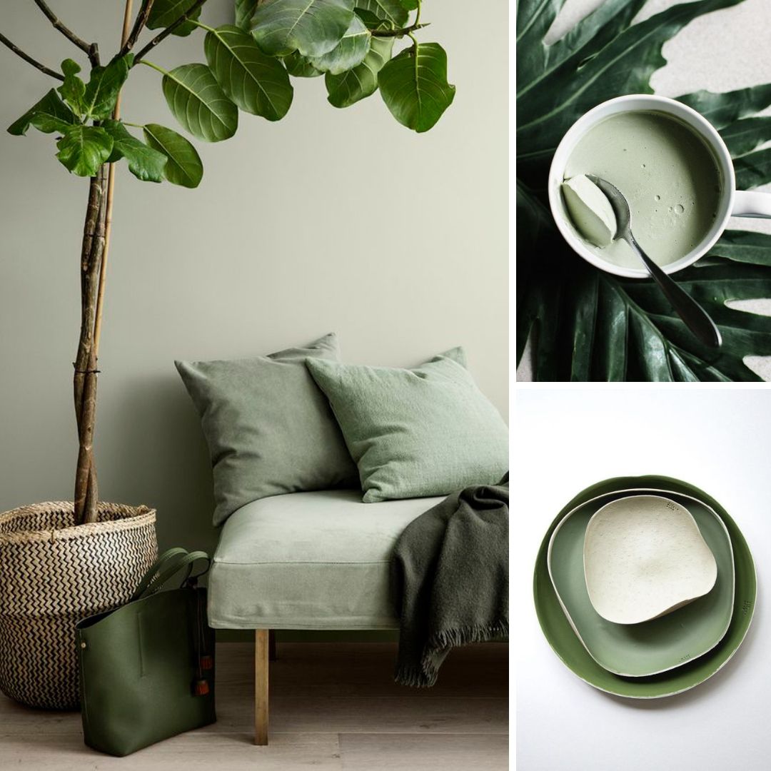
Greens resonate with lovers of Nature in Her free, unbridled forms – although this could be the Blue palette for some. It’s a colour of nurturance and renewal, health and wholesomeness; and prosperity. Interestingly, it’s a colour recommended for certain spaces where ‘money manifestation’ is the dominant feeling!
ORANGES AND YELLOWS
They convey the ‘sunny’ disposition of the space, and residents therein. It almost follows that yellows and oranges invite visitors in the space to reconnect with their zest for life in never-tried-before ways.
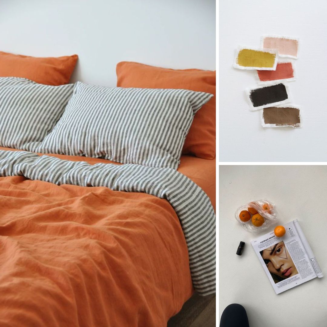
These are the colours of ‘harvesting’ new hope, of ‘fire’ in the belly and a recharged zeal for
‘Getting the job done.’ In a cheerful, but assertive way, they talk about taking charge of life, not just as we know it, but as we imagine it will be moving forwards; while making space for its sweetness and pleasure, too. All work and no play…., after all!
REDS
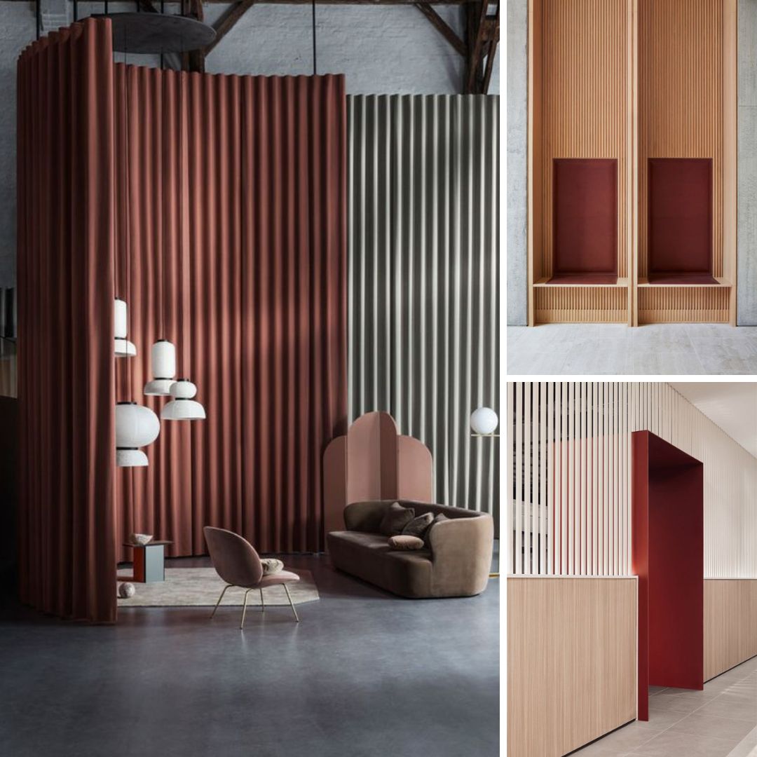
It’s up for an open debate. Does any other colour palette say ‘Look at me!’ as strongly
Like Oranges, Reds ‘up the ante.’ In the right amounts, they’re all about attention and energy; stimulation and movement; and an appetite. Overdone, the red palette can send our systems into overdrive, though. It can affect sleep, and can even have psychosomatic effects on hormonal, or blood circulation processes.
PINKS AND PURPLES
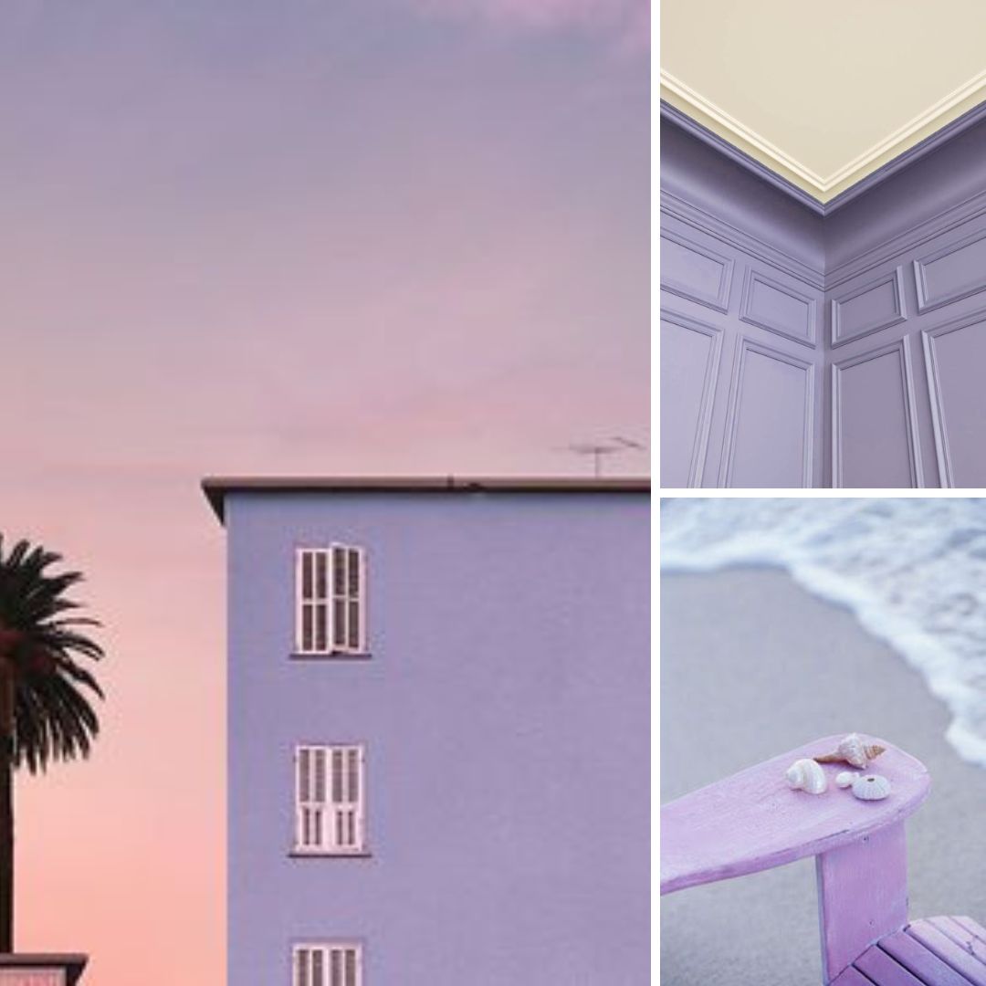
Like the Blues and Greens, Pinks and Purples have their own way of inducing calmness, and bliss. They speak to those who wish to convey their individuality in a memorable way. However, unlike more feisty counterparts, those who choose pinks and purples to convey their ‘unique streaks’ prefer to do so with a certain degree of grace and poise. The beauty of it is that it’s not intimidating. In fact, it’s quite intimate, but without revealing too much in a way that might be improper, or an invasion of privacy.
A NOTE ON THE HIGH AND LOW TIDES OF INTENSITY
An artist working with oil paints and watercolours, and a photographer experimenting with digital tools might have their own takes on pigment intensities a all of which would be quality interesting.
But, they will certainly tell you about differentiation via tints, and shading. Simply put, a tint, and a spot of shading here and there, can make all the transformative difference, because they can lighten and darken the colours. They’re what can make ash rose turn raspberry, sunflower yellow into mustard ochre, salmon into blood orange…. we see the pattern here.
As the popular saying goes, it certainly does take different strokes to make the world. The more we feel, the more we explore, the more hues we see, and there’s one for everyone who is seeking a special colour, for living spaces so personal and precious.
