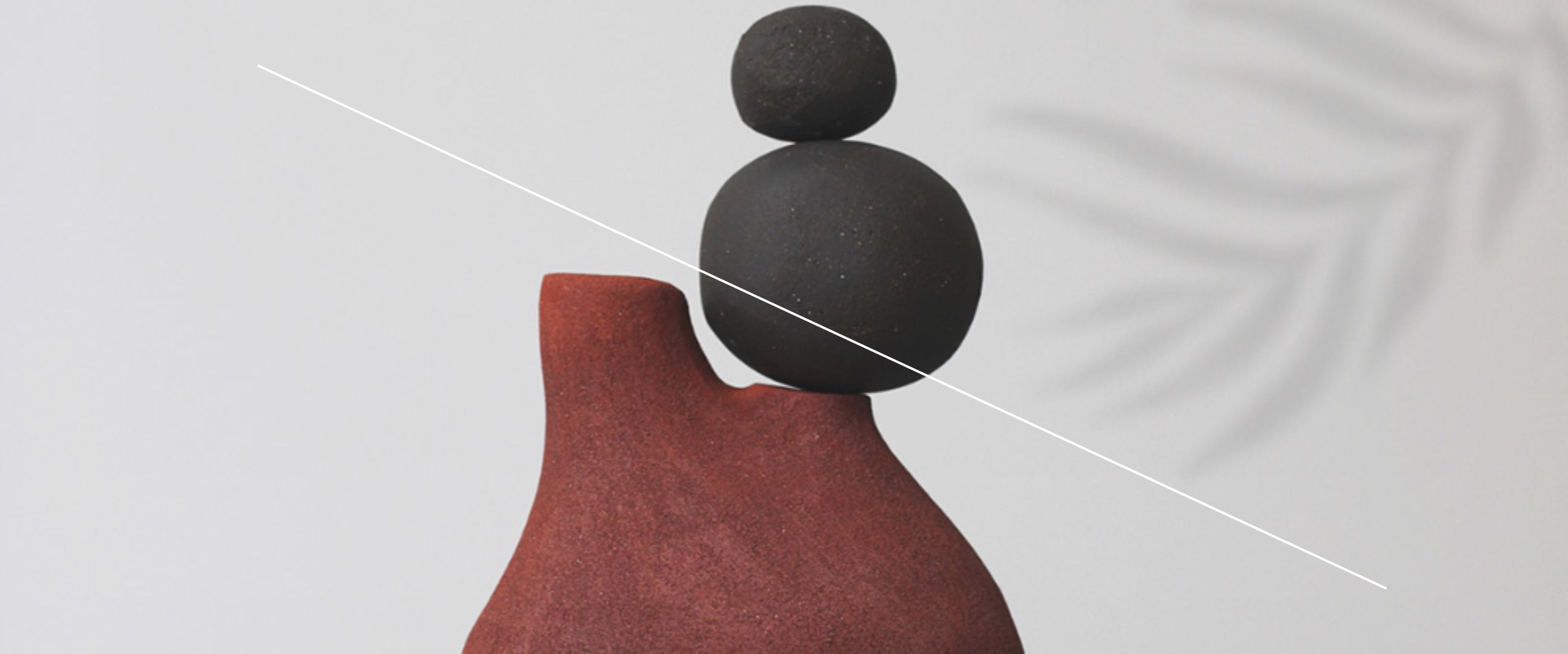

Don’t Be Afraid To Mix Prints & Patterns
They’re inspiring, they’re fun. When there are too many options, they can also be VERY confusing to work with.
Here are some basic tips and guidelines to help you make the most of your interiors project.
MAYBE DIFFICULT, BUT NOT MISSION IMPOSSIBLE
As first steps, it’s important to be sure that this is just an ‘injection’ of new ideas, or that it’s a complete do-over. Perhaps, a needless to mention fact – except that it’s really not.
The creative and visual invigoration that comes through from working with prints and patterns; the promise of a most spectacular reincarnation for the space – all far too tempting.
So, knowing where to start and when to stop, is the first important commitment.
Next, comes the relatively simple exercise of surveying the existing colour, pattern, and texture schemes – not just of the space in question, but other major areas, as well. Yes, all rooms can have their distinct identity, but connected as they are under the same roof, there have to be some common denominators, for cohesiveness.
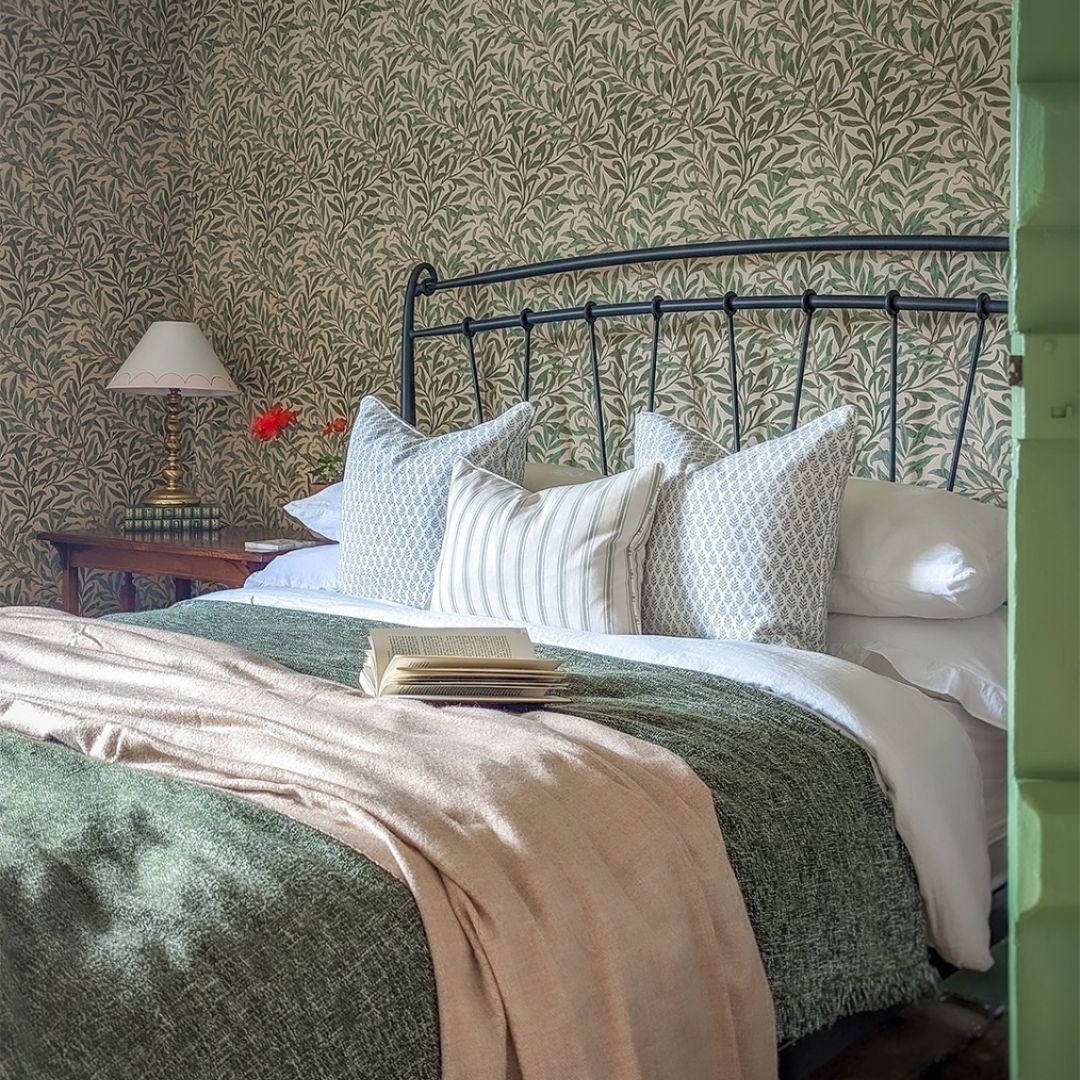
During this exercise, it’s helpful – in fact, crucial, to lay out samples of swatches of prints and patterns that you may have shortlisted for a space.
As a result, you may find that the above mentioned common denominators are jumping out at you automatically – be these an outstanding motif theme, such as florals or geometrics; a texture, such as ‘mottled;’ or a style of applying a print or pattern, such as sectional, or all-over repeats.
Suddenly, there’s more detail to begin with than you thought!
HOW MANY IS ENOUGH?
Three, or four is usually considered a safe enough number.
Different spaces, different sizes. Each with their own mix of portions that have styling potential, and portions that are best left as they are.
Accordingly, even a quick intuitive survey will give you an idea of exactly how many prints or patterns you have scope to work with – although, you can be as analytical about this as you consider necessary.
MIXING MORE OF THE SAME KIND
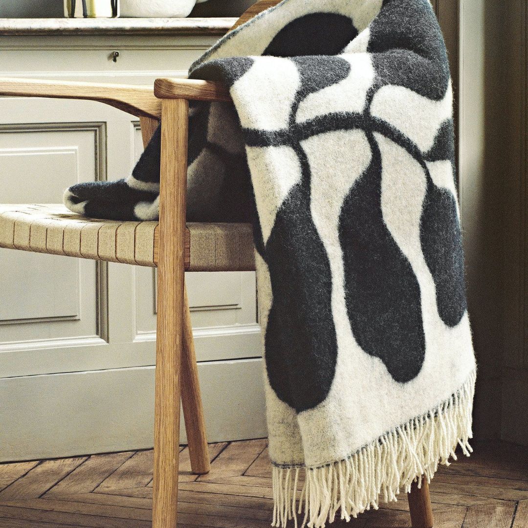
It could be a case of just the one, bold, unapologetic motif, or design. Repeated at regular intervals throughout your choice of fabric. It could be borrowed from the flora-fauna, or modern abstract genre.
Chances are, you’ve chosen it for the stop-in-your-tracks visual impact.
Less is truly more, in this case. Either it floats in the background, as drapes or curtains; or it graces the main sofa; or the accent loungers.
Then, there could be a case of a baroque and trellis design; or geometric patterns spreading themselves through every inch of the fabric.
Don’t stress. Remember that your first investment was in a good quality, mindfully crafted fabric.
Study it. You’ll find that such a fabric wouldn’t usually be without a carefully orchestrated combination of base colour and print-pattern details.
That’s half the job done already!
Now, you’ve to choose – how opaque should this all-over print or pattern be? Simply put, how sober, muted, or ‘transparent?’
Sometimes the all-over print or pattern is so fine, so subtle, that it doesn’t register until observed at very close quarters. At other times, just the outlines are discernible, so you know something’s there.
Those who are habitually comfortable with pattern-on pattern play may not mind the details packing a punch.
Otherwise, mixing hues from the same colour palette helps so that the overall effect isn’t an eyesore, and it’s still a quite pleasure to soak up the details – delicate as they may be.
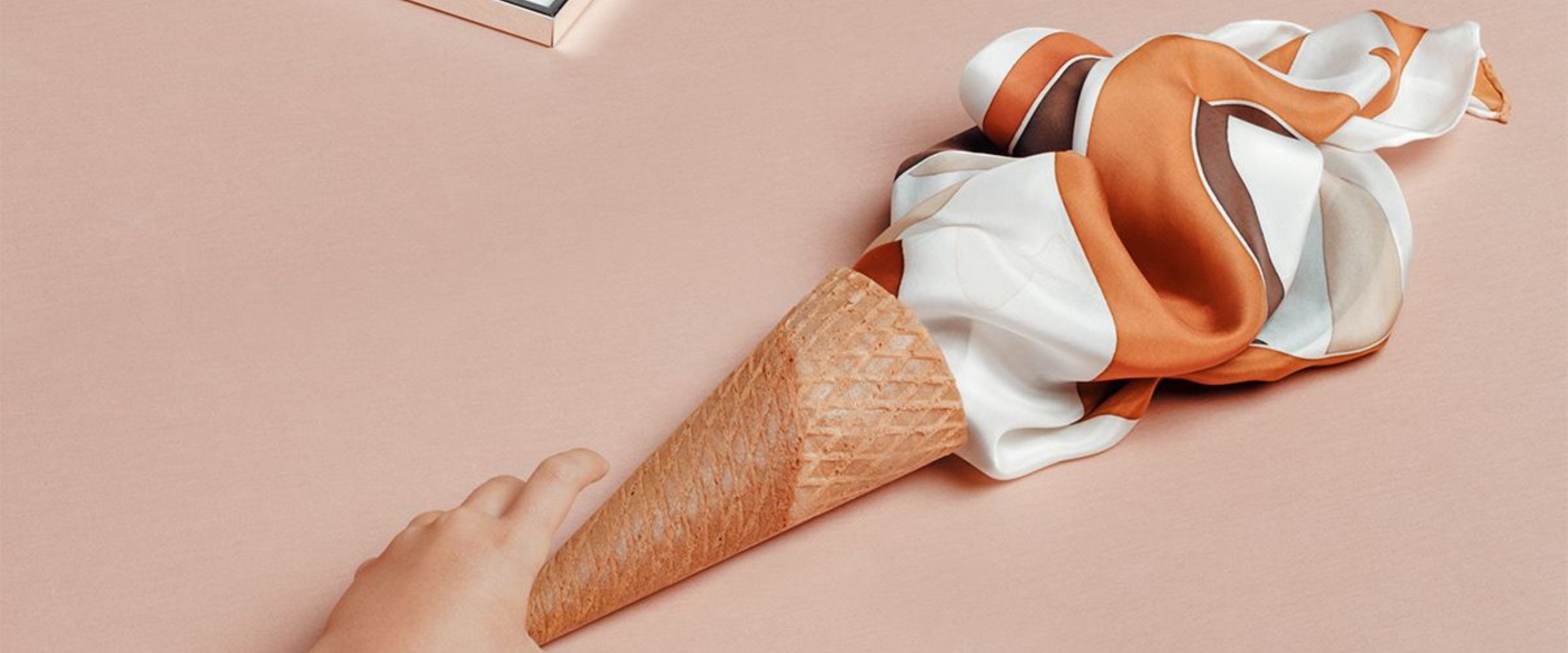
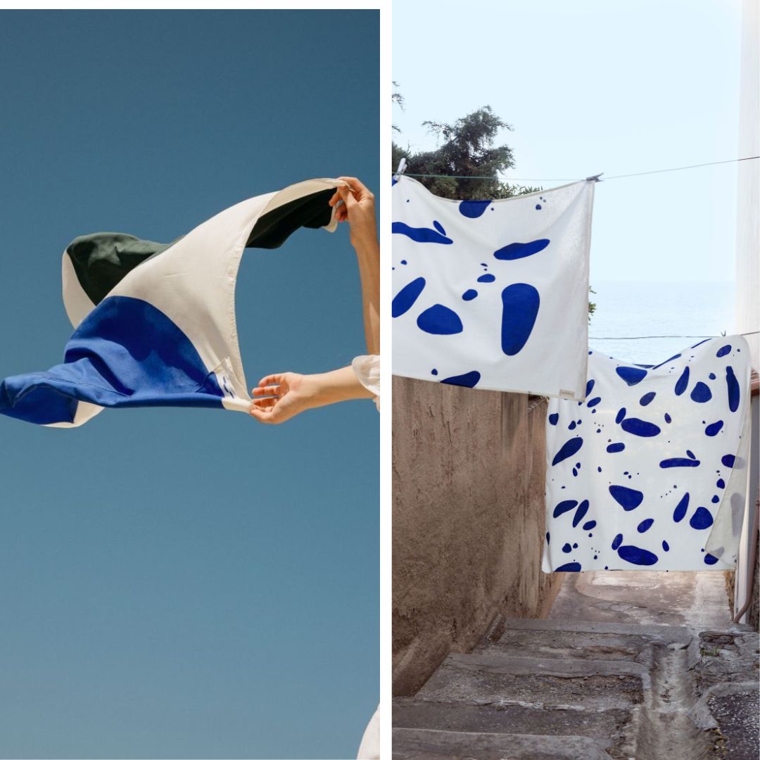
MIXING MORE OF DIFFERENT KINDS
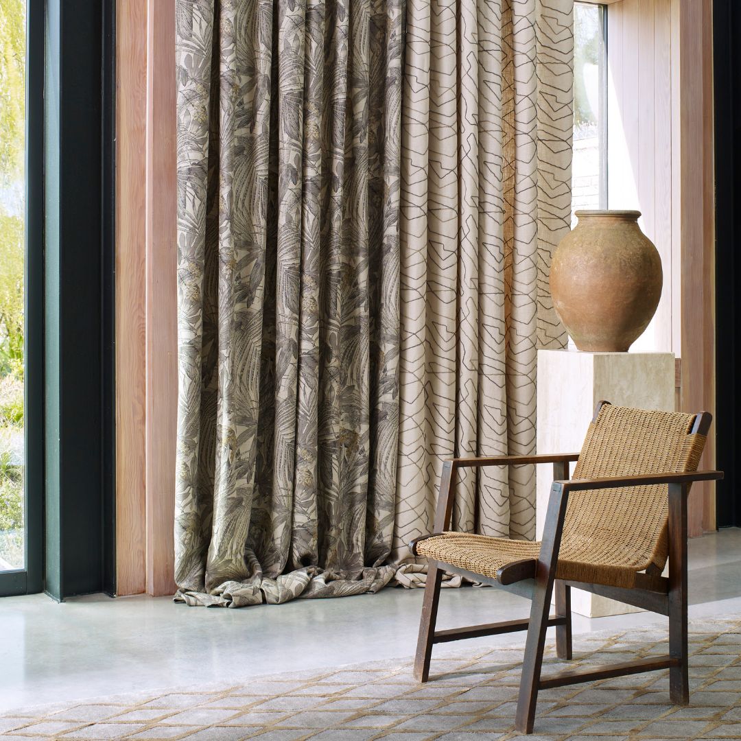
Again, look for a common denominator. One fabric may have ‘bursting blooms’ and the other may have a surreal 3-D effect mesh designs.
But, are the designs in a similar ‘matrix’ or criss-cross vertical-horizontal placement? In other words, is it a grid of flowers and also a grid of squares or cubes?
Perhaps they can be layered, with a fabric in a completely opposite colour scheme between them.
Another simple way of ‘cross-pollinating’ prints and patterns is by establishing the degree of ‘movement’ or ‘animation.’
Gliding paisleys and running zigzags are exactly that – gliding, and running. Both, different kinds of movement, but similar in that they’re movement, in essence. Surprise yourself by experimenting with their arrangement throughout the room.
BREATHABLE, NOT JUST BEAUTIFUL
If justice is to be done to their uniqueness, to the hard work or ingenuity that gives them form, patterns and prints need to be able to just… be.
Your space can be as visually stimulating as you deem right, but it would be a shame if the overall impact is just downright claustrophobic.
Depending on size and scale, coordinating hues from the same palate, or coordinating base colours across palates may not suffice. The ‘blocking’ effect may need to expand itself beyond just the colours, to entire objects – basically, furniture pieces, or the walls, even.
For this, consider the way the room’s natural layout guides the eye. Where’s the natural ‘cascading’ possible, for a layered look? Where can the ‘block’ or the print-pattern repeat itself at alternate intervals?
LET THE THEMES BE RELATABLE TO THE PURPOSE.
Toile fabrics are truly lovely in recreational areas – romantic, nostalgic, inviting.
Quirky puzzles, birds with hats and purses, swinging monkeys, laughing lions and enchanting night-sky themes are better suited to children’s nurseries and rooms. A fertile canvas to their expanding imagination, would be one way of looking at it.
To be sure, older children and young adults may not like any prints and patterns at all – simply because they’d like to decorate their walls or ceilings with posters, anthems, photo collages and other such ‘symbols’ that define important concepts, and milestones, at their developing age.
Stripes and cording, tessellations and tiles, plaids and lattices can help give a great formal look, when used in measured amounts.
Kitchens do well with textured patterns if you’re going for something smart-casual. Marble-effect abstracts, ikats, and damasks can give bedrooms of adults an air of dreamy decadence.
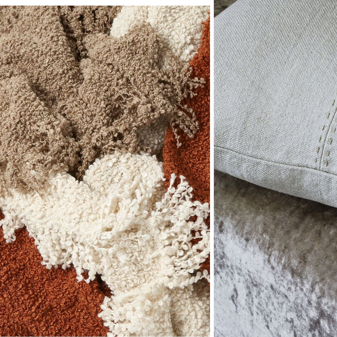
PAY ATTENTION TO SURFACE LOOK & FEEL
The chunkiness of embroidery. The haziness of a digital print. Natural scruff of linen, or ‘kinda-sorta undone’ knobs of bouclé.
Not just texture-trends to tick off your project’s to-do list. They’re crucial influencers of the overall feel of your space, and important refiners of your choice of print or pattern.
HOLD UP – WHAT IF I’VE NEVER USED PRINTS AND PATTERNS
No worries! You can start with smaller elements that you can either transfer to another space, or keep shifting around in the same space till you feel you’ve hit the nail on the head.
Say, the inside panels of a transparent cabinet. Or, the inside of the arms of your sofas. One of the smaller chairs? Maybe some adjustable or moveable wall art in fabric? Just a table runner, then. If all else fails, the good ol’ trusty cushion!