Living Space Focus: The Master Bedroom
The room Mum and Dad get to call first dibs on – yes, we feel you!
The lucky family members to land the master bedroom aside, we think it should simply reflect identity: after all, this is the very personal space of someone who is master of their own life-story.
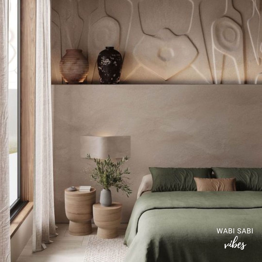
It’s in the name – typically, the master bedroom is the biggest room in a living space. Depending on the design and layout of the house, master bedrooms also tend to offer a definitive view. Better than any other room of the house, even. This view could be of your private lawns, pool and lawns, or simply a great angle on the natural scenery, beyond the premises.
MAIN DESIGN AND STYLE ELEMENTS TO CONSIDER
- Suite deal:
Larger master bedrooms have more scope for compartmentalisation. Doors can separate the area where the bedroom and en-suite bathroom is, from a ‘lounging’ zone; and in some stupendous cases, there’s even a separate, small powder room for guests.
The natural size of a space can call for ruthless editing. With patience and passion, any kind of space can be elevated into the master bedroom of your dreams. - How will the eye travel?:
Suite-like or not, as soon as the main door opens, the eye moves in a pattern or direction, so as to soak it all up.
Spacing and aesthetic distribution can make this experience clutter-free, and clean – whether you’re maximalist or minimalist. - Scope for letting natural air and sunlight in:
Does your master bedroom have windows? Windows and skylight? How will that affect your choices for lighting, colour, texture, and add-on furniture?
CONFUSED ABOUT WHERE TO BEGIN?
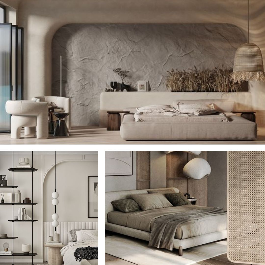
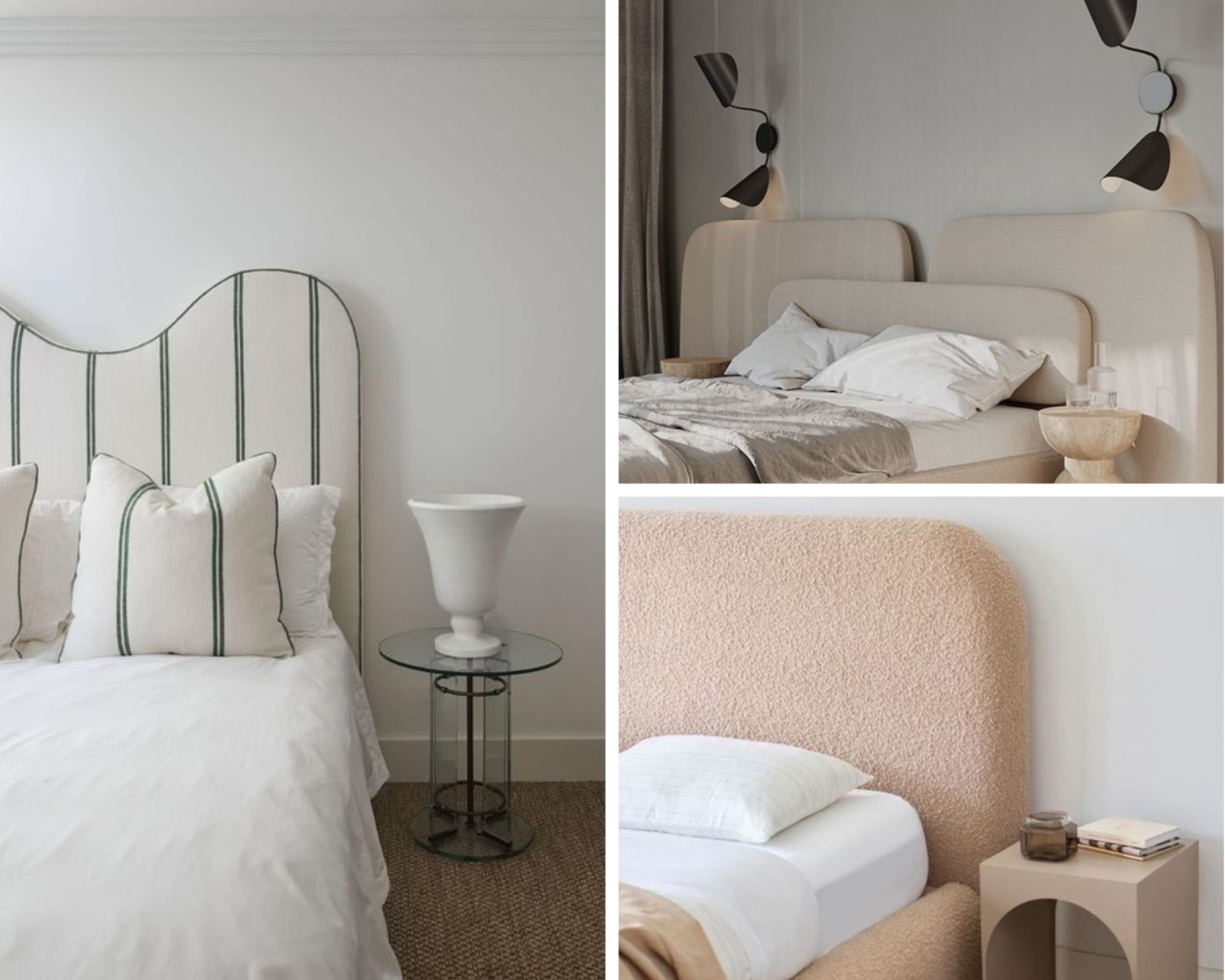
Use the head board, or bed head, as a visual anchor. Navigate in a simple scale-perspective direction from there. It IS the bedroom, so the area where your bed’s laid out, is going to capture attention first.
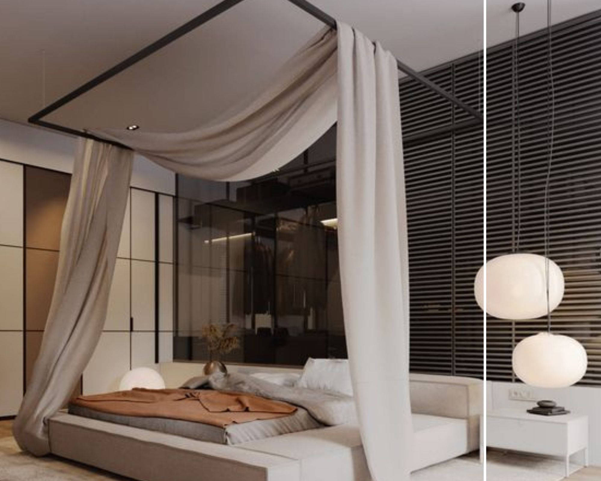
If there’s a four posted bed frame, pick sheer or semi-sheer drapes for romantic whimsy and drama, especially if your master bedroom receives a lot of natural light. These can be easily twirled, braided or pleated, and then tied to the frames when not in use.
LET COLORS OR PATTERNS BE DREAMY, BUT ALSO INSPIRATIONAL
Whatever the topic of discussion in the private sanctuary of your bedroom, we’re going for colour psychology that supports positive pillow talk.
Shades of caramel, sienna and cinnamon, or apricot and dusty rose can evoke feelings of warmth, grounding, and time-travel to some old, favourite memories.
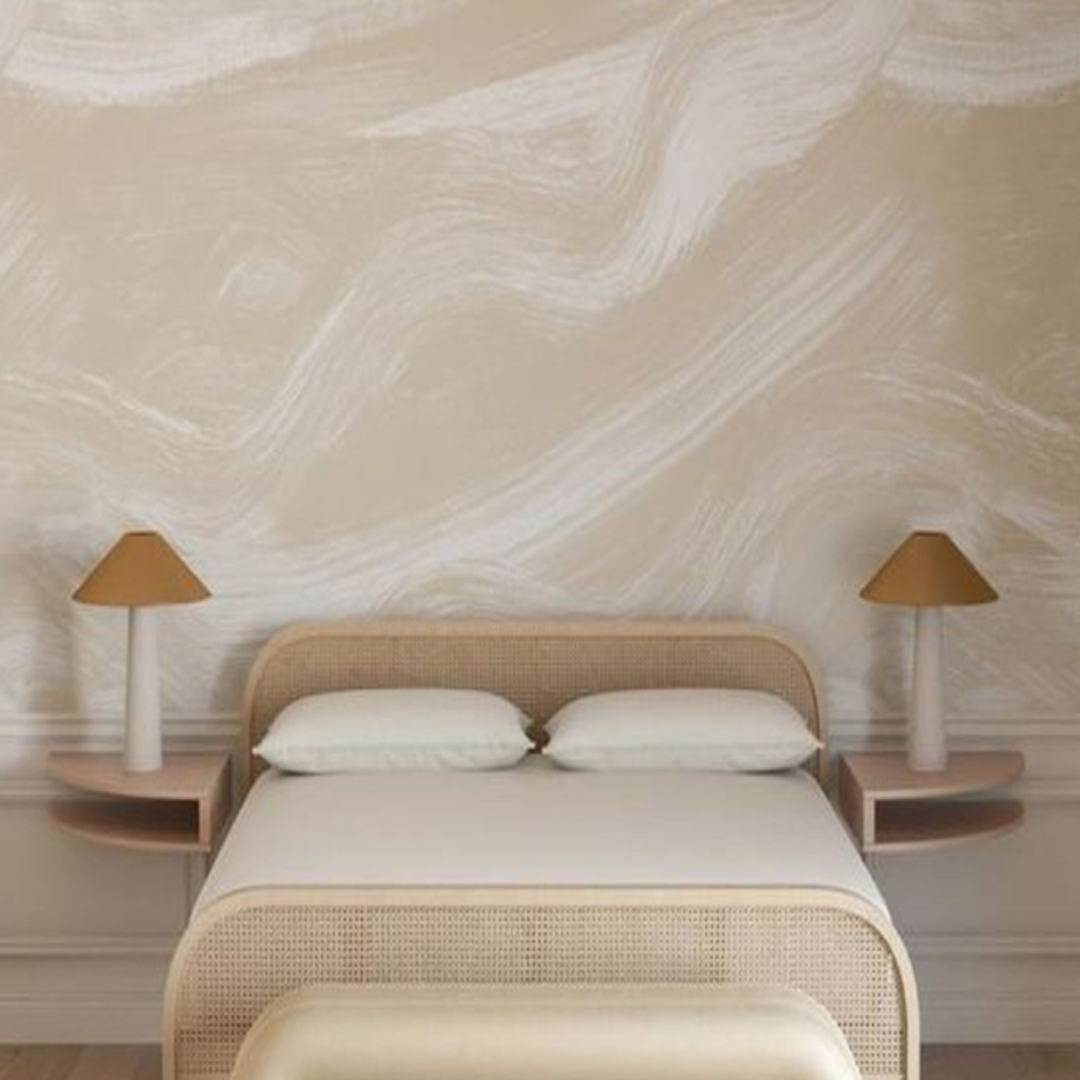
Pastel blues and greens are dream-like and meditative, but they can also be invigorating. Classic monochrome combinations – like alabaster or pearl white, and ash or smoke grey – remain a safe bet. They offer a balanced blend of secrecy and intrigue, with fluid neutrality.
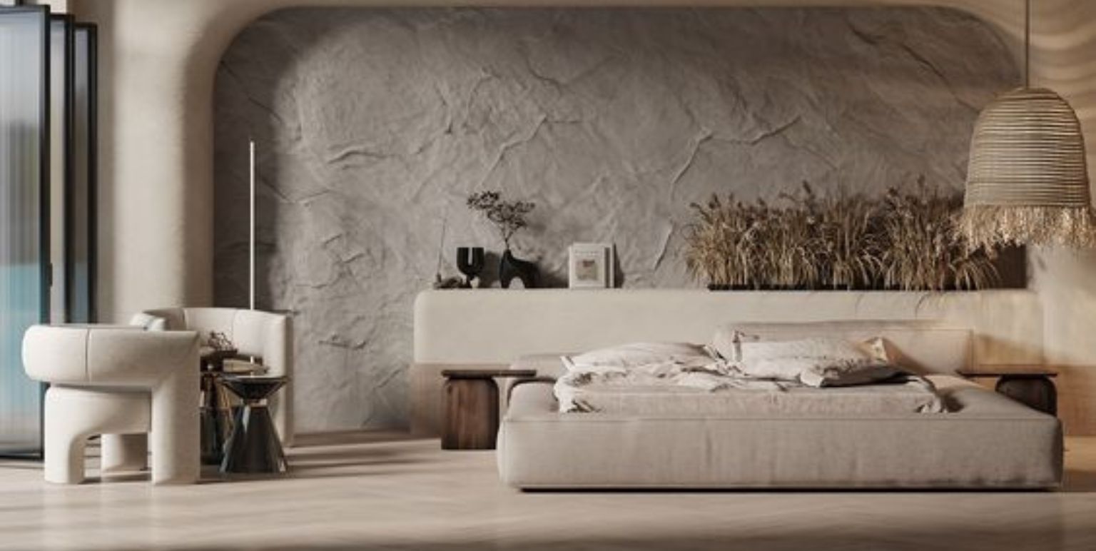
If you’re feeling adventurous, you may like to designate an accent wall that’s in a completely contrasting colour-texture-pattern story against the rest of the room. For instance, a lavender wall in a sage green room.
Wallpapers and paint have their own pros and cons. But, everyone has their own take on time efficient functionality and for this, perhaps it’s easier to play with peel-on, peel-off wallpaper.
Fine detailing and symmetrical motif placements can make even the most voluminous patterns feel minimalist. The visual continuity that runs wall to wall, then, feels like an enchanting ‘safety blanket,’ while you’re preparing to tuck in for the night, or reading by yourself, or Netflix-ing.
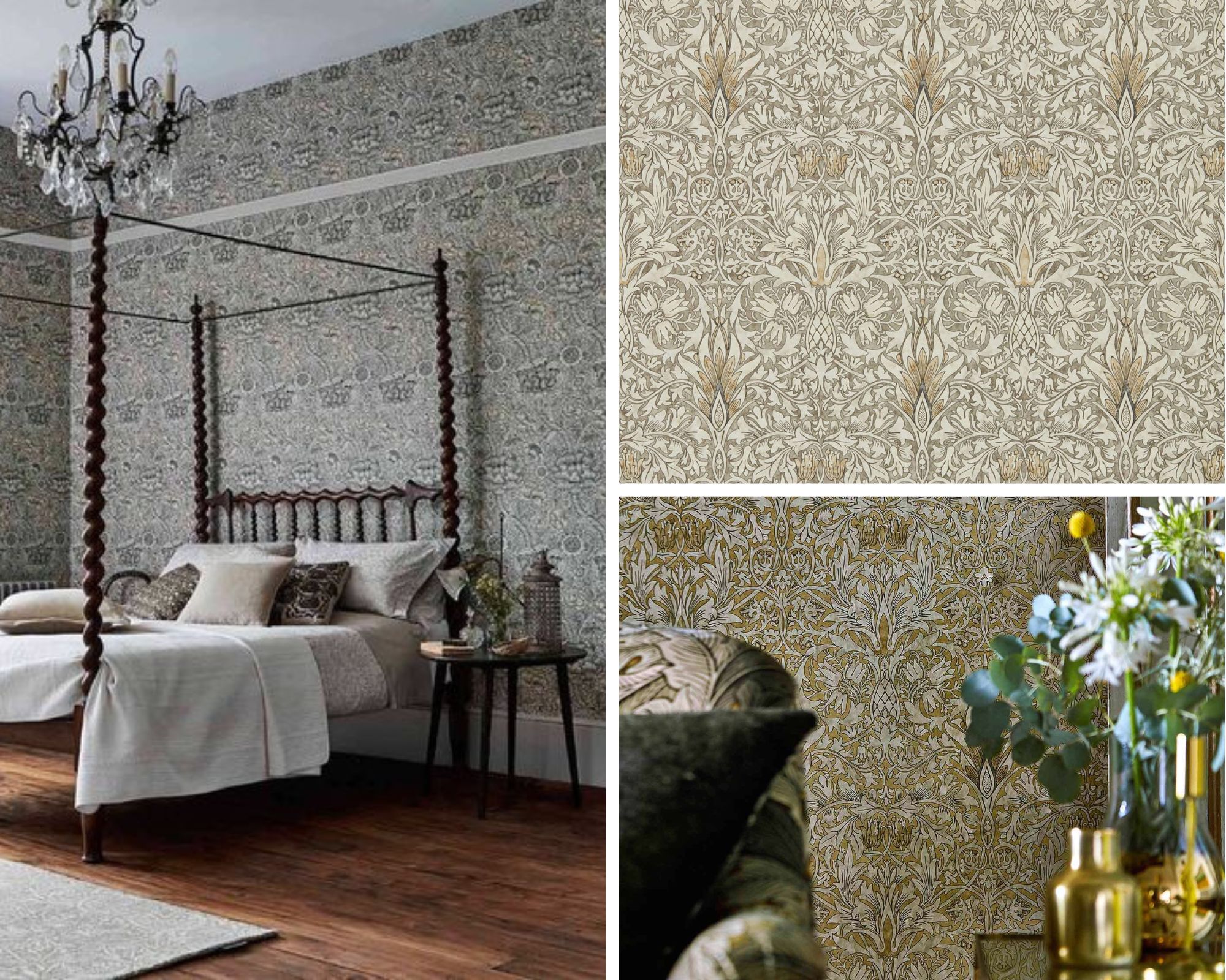
If you’re not too sure about that, but you like patterns, then choose wallpapers that have a statement motif, on its own or repeated at systematic intervals.
Don’t miss the ceiling. Whether it’s an exact replica of the walls, or not, is completely a matter of personal preference. What you see on the ceiling can affect restfulness, so take your time to decide!
MAKING A CASE FOR THE BED BENCH
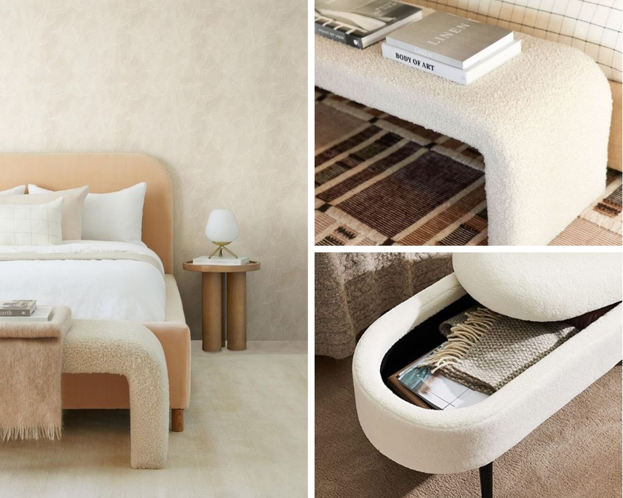
Bed benches can be as functional as you want them to be. They’re a seating option, and can be paired with a pouffe to offer additional rest for the feet. Bed benches can also double up as storage, for duvets, pillows, and other bed linen.
To balance visual impact, choose side tables with silhouettes that harmonise with the silhouette of your bed.
Consider a bed bench that does the same thing near the feet of your bed. The resulting seamlessness – side tables to the bed head, and a bed bench by the feet – creates a boundary of sorts that doesn’t look like a boundary but can feel like one. Convenient.
THERE’S ALWAYS SPACE FOR A CUSHION….
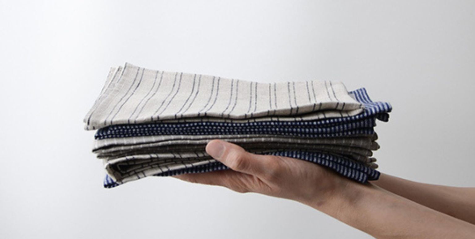
An easy finishing touch. Mix and match cushions for the bed, in a way that your choices accentuate the walls, and complement the bed linen.
If your master bedroom has space for accent chairs, then one cushion each can be sufficient and soulful. Larger cushions can work as casual seating, or just ‘touch therapy;’ if you have a small low-lying table where you enjoy a cup of coffee, or just a catch-up call with your best friend.
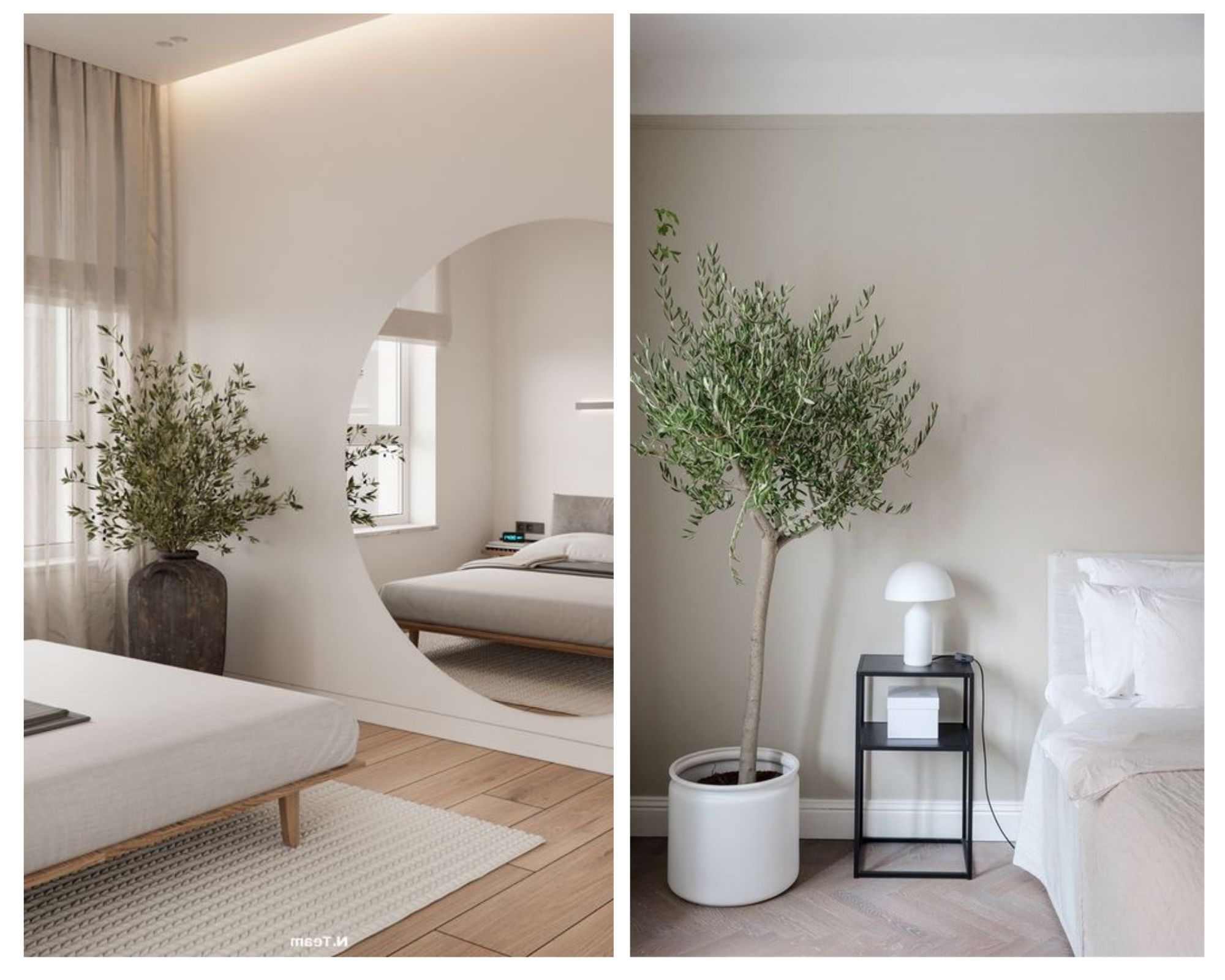
GREENS AND FLOWERS
Leaning shelves against the wall are a cutesy option for potted plants, and a clever way of saving space. So are windowsill baskets and hanging planters.
Style plants on indoor shelves with earthenware, like ceramic decoratives, although greens and flowers are loved because their unique qualities speak for themselves.
Dried twig, leaf and flower arrangements are increasingly chosen for an aesthetic touch in bathrooms, simply because they’re so neutral.
If you feel you need them, and would like to consider them for your master bedroom, a local nursery can help you with sourcing green plants that are particularly strong air purifiers, or child and pet-friendly, or good for breathing problems.
