
Retrofuturist Home Design: Remembering When It Was a ‘MAYBE’
Art movements have their moments in the sun, but one that’s really soaking up the cosmic spotlight, is Retro futurism. Though it’s widely believed to have been in existence way before there was a word to describe it – more on that when you read ahead – multiple sources agree that it ‘had a name’ when experimental sound artist, editor, and publisher Lloyd John Dunn called it so in the 80’s.
SIMPLY PUT…RETROFUTURISM IS…
Creative, artistic depictions of the future, in an earlier era.
To be retro about it, would be to revisit the nostalgic wonderment that believed such a futuristic landscape was possible. Many such landscapes aren’t a reality yet, and they never might be. There’s a term for that too – paleo futurism – or, ‘the future that never was,’ as it’s popularly described.
THE ELECTRONIC HOME LIBRARY WITH ITS CURVILINEAR FURNITURE HAD ALREADY BEEN IMAGINED
However, the tension, or, if you prefer, the chemistry, between nostalgia and novelty, the past and the future, conceived spectacular design innovations that have become a reality, or are certainly a work in progress. This calls for a tribute to futurist illustrator and industrial designer Arthur Radebaugh.
Radebaugh cartoon illustrations in the series ‘Closer than We Think!’ (1958 to 1963) showed futuristic scenarios that are mid-century modern, and beyond that.
FROM RADEBAUGH TO THE JETSONS’ SKYPAD
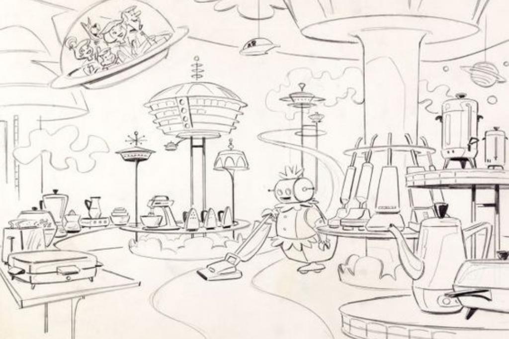
Yes, you read correctly. The home and world of the Jetsons, that famous cartoon family. What if, we, in our post-modern and hyper-postmodern lives, are but the ‘Retrofuturist’ stage of that eventual evolution? Who knows? Maybe there will be a blog written in a WFH sky pad of the future, referencing this one!
Radebaugh’s work actually inspired the futuristic vision of the Jetsons’ jet setting life.
We stumbled upon this Smithsonian Magazine comparison, between ‘jetsonian architecture’ in a vacation home of the cartoon, and a villain’s hideout in the Alfred Hitchcock film, North by North West (1958).
Once, freakishly outlandish, perhaps. Now, so very modern minimalist. Having said that, some may argue that the distinctiveness is so distinctive that it could be dated, or ‘zeerust.’ We say this only applies if the benefits of timeless versatility are completely missed!
NOW WELL INTO THE 2000’s: WHAT ARE THE RETROFUTURIST TRENDS?
The space lounge aesthetic, despite its ‘out there’ appeal, possesses a profound connection with not just spatial orientation, but natural lighting, and biophilia. This aesthetic has extended beyond the lounge, to the whole home.
In 2021, Ukrainian designer Nat Talichenko completed the Baan Bubble Dome House (Kharkiv, Ukraine) with a distinctly Retrofuturist touch. There isn’t a single straight wall in the building – all are curved, with a slope. A snow-white Bubble Boat is attached, in the spirit of a galactic ship. The house offers beautiful sunset views, and boasts of unique thematic gardens.
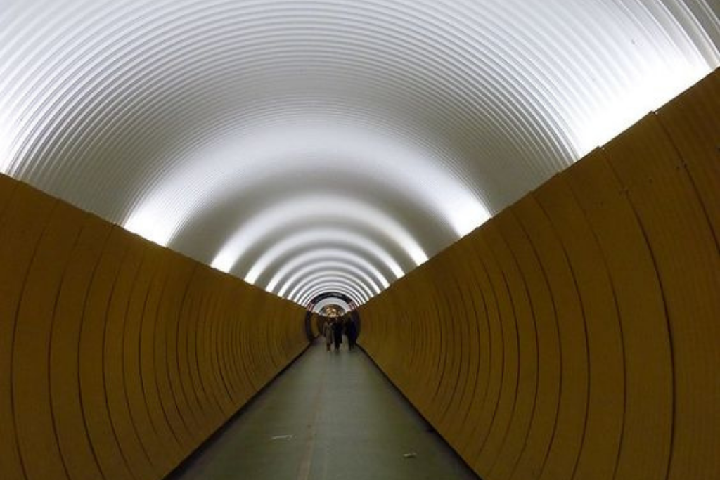
Some of the trends may be out and out futuristic. Others are an overlap with more traditional trends that look like they’ve received a touch of a makeover.
HOW DO I SPACE LOUNGE IT WITH MY INTERIORS, THEN?
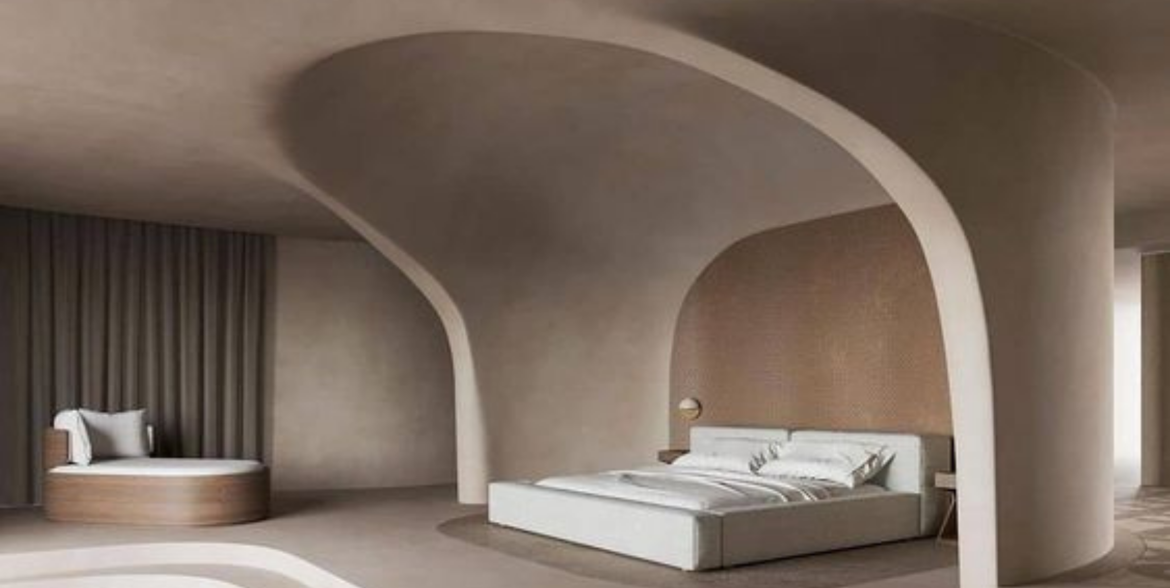
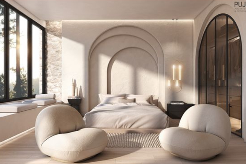
If you have curvilinear walls, and sufficient exposure to natural light, we recommend a
Balanced mix of beiges, silver-grey or pewter, and more chalky-powdery versions of pearl, alabaster, or eggshell white. These would do well through the seasons, and lend themselves to enticing light-shadow play.
Accentuate the effect with overhead radial detail lighting installations, like pendants. Or, those with a stark, yet sleek structure, and high shine monochromatic or mineral polish finish. Built-in, linear LEDs are also increasingly popular. Try ‘shape-shifting’ furniture pieces, with sloping backs, or curved armrests that look part-Art Nouveau, part-Biophilic Interiors.
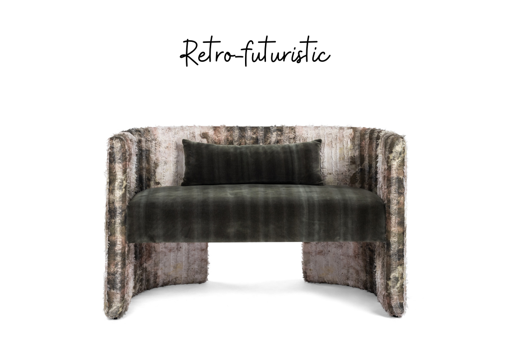
Don’t forget their more geometric counterparts, where planar juxtapositions look more like a choreographed dance, or march through galactic highways!
You may also like to consider ‘floating surfaces’ in spaces where you want movement and conversations to flow.
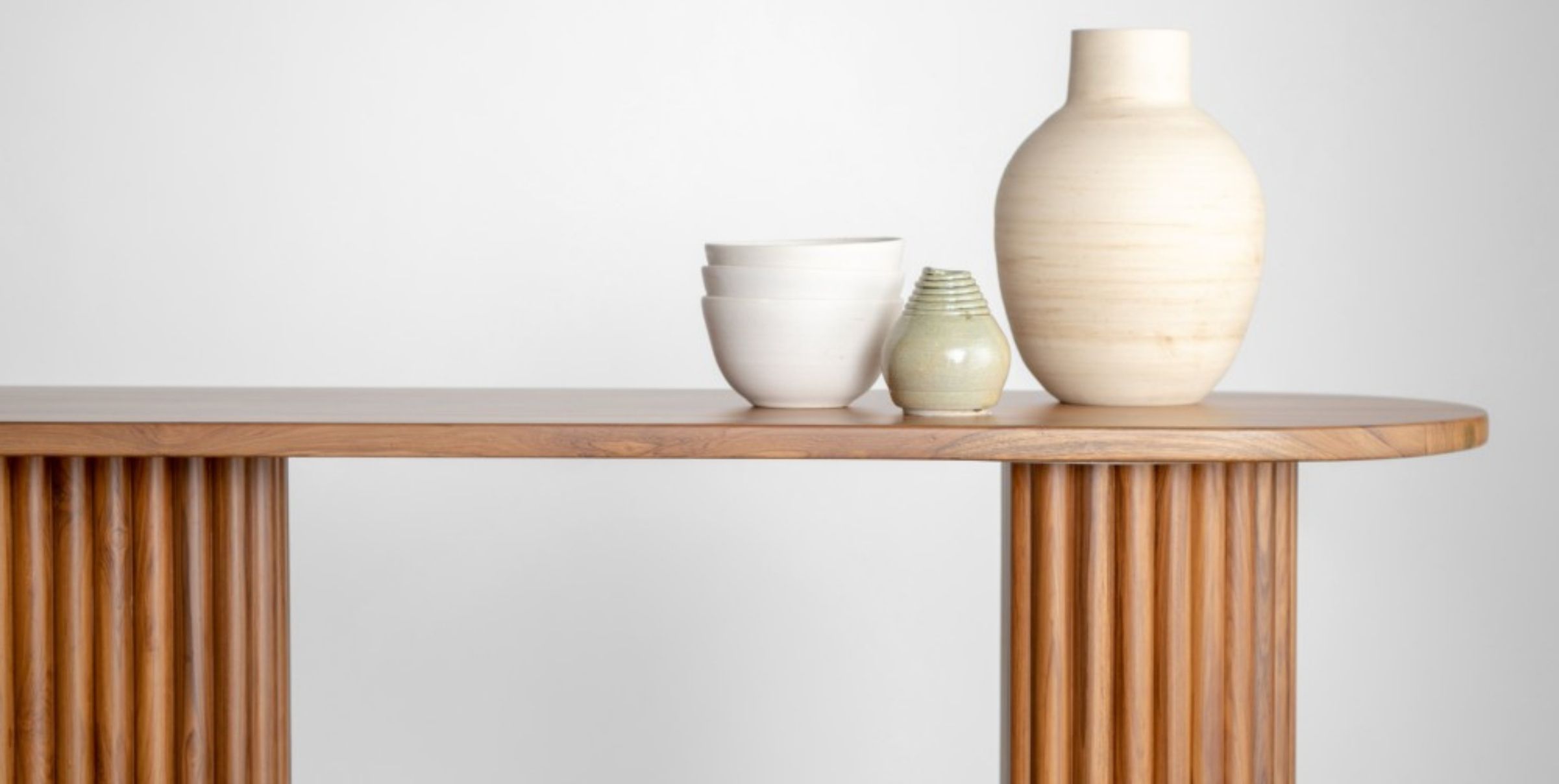
Smooth marble, MS steel finishing, and even-textured wood with deep, rich, dark polish lend themselves to the curiosity-inducing, touch-feel attractiveness of Retrofuturist styling. In their own way, so do concealed-detail writing tables and corner tables.
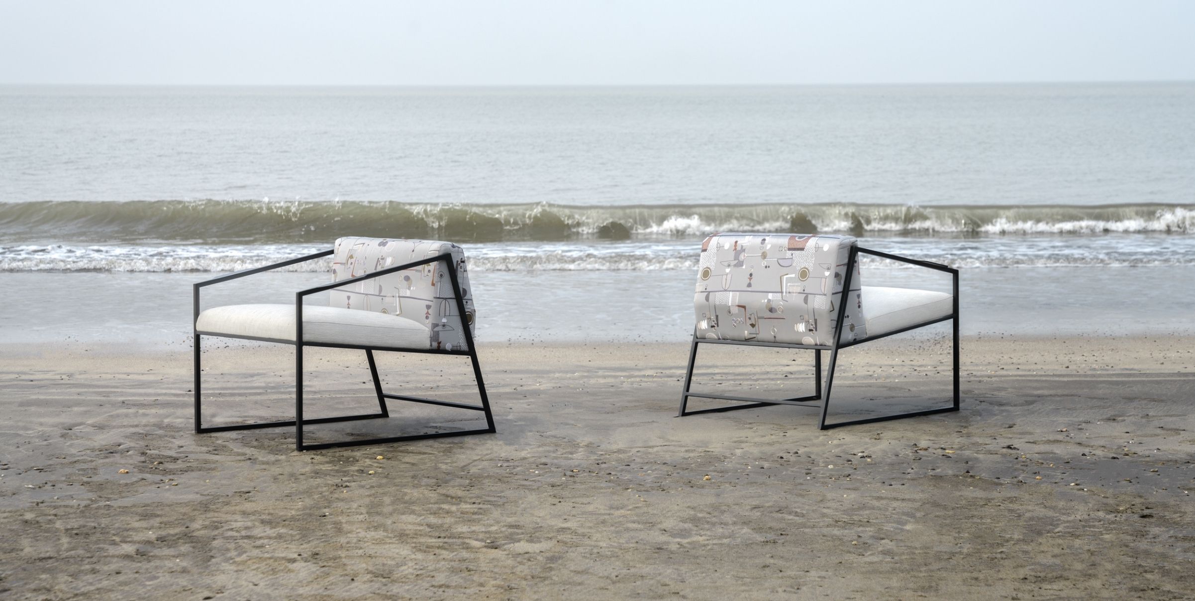
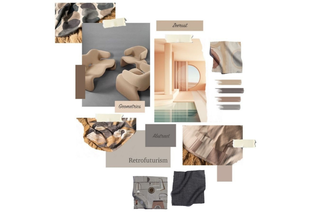
Never forget the near-instant magic of fantastical fabrics! You could reupholster just your favourite chair, or the entire layout, or surprise yourself, and your loved ones with never-seen-before drapery.
Try fabrics with all-over geometric tessellations and matrices, simple line sketches, or still-familiar abstract surrealism. On a canvas of neutral colours where the striking factor is in the colour contrasts, these offer a happy middle ground between the extremes of neon colours or overly exaggerated shapes.
