Vouching For Viva Magenta
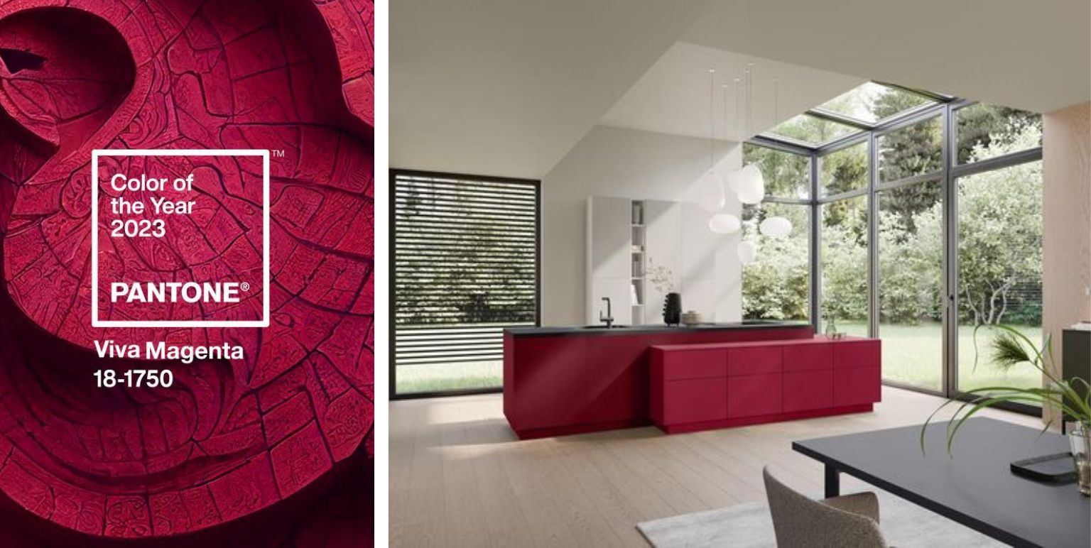
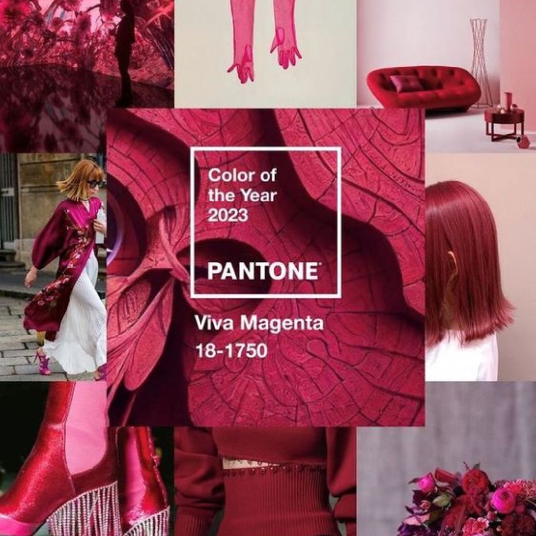
Pantone® describes its Colour of the Year 2023 – Viva Magenta – as an unconventional colour for unconventional times. How can we make it work in our living spaces?
HEART AND SOUL OF THIS SPECIAL SHADE OF RED
Leatrice Eiseman, Executive Director of thePantone® Color Institute has provided a description of Viva Magenta that, frankly, makes us stop for a minute, and process the message beyond words that we see.
Says Eiseman,
“In this age of technology, we look to draw inspiration from nature and what is real. PANTONE 18-1750 Viva Magenta descends from the red family, and is inspired by the red of cochineal, one of the most precious dyes belonging to the natural dye family as well as one of the strongest and brightest the world has known.
Rooted in the primordial, PANTONE 18-1750 Viva Magenta reconnects us to original matter. Invoking the forces of nature, PANTONE 18-1750 Viva Magenta galvanizes our spirit, helping us to build our inner strength.”
Amidst the season of spring (and of love!) this really tugs at the heartstrings. How so?
Well, every opportunity to create – in its own way – carries fresh promises, like spring.
Then, biophilia inspirations are always rooted firmly in our art or design visions.
Finally, as makers of what we believe are beautiful fabrics – trying to maintain a respectful synergy between tradition and technology in the process – it naturally creates a profound impact on us to learn about the connection between Viva Magenta, and its source of inspiration, a treasured natural dye.
WHAT WOULD VIVA MAGENTA SAY ABOUT MY HOME – AND ME?
That you’re willing to take a deep dive into many shades of joy and adventure.
That you’re excited about increasing your chances of success when you spin life’s ‘Wheel of Fortune,’ simply by showing up; inviting good luck by giving hard work the energy or momentum that it deserves.
That you’re brave, and optimistic.
That by blurring the boundaries between the everyday and the outlandish, the obvious and the hidden, you leave a little to the imagination and keep people guessing!
OK, SOLD – COLOURS AND OTHERS THAT WORK WITH VIVA MAGENTA?
They say if you take care of the more challenging aspects first, the rest is easier, and you get more work done in less time.
Walls and ceilings come to mind, and then the larger pieces of furniture.
As a colour, Viva Magenta straddles ‘warm and cool,’ and so we reckon is a great choice for just about any room in the house. If it’s going to be the dominant colour in a space, assess how natural and artificial lighting intensities are likely to affect it, before deciding if you want complete or partial coverage.
It’s also down to how you describe different sections of your living spaces. For some, the drawing room is formal, and for others it’s anything but.
Bedrooms are supposed to be serene for some, while others may feel it’s the one room that must be as quirky as possible, because it’s THE most personal room in the house.
Try using it on a singular ‘accent wall’ first, if you’re opting for paint, and see how you feel if you were to imagine it on every single wall.
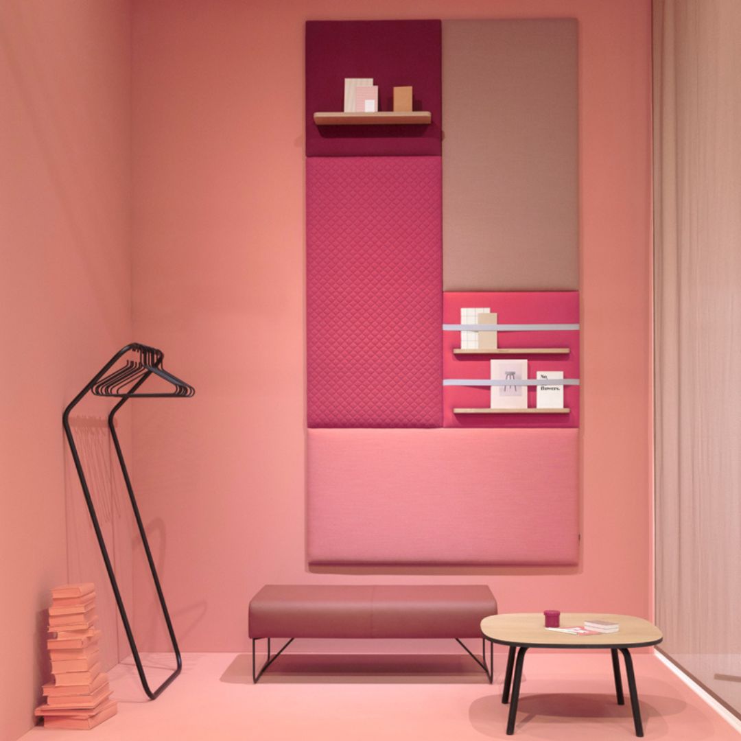
With wallpapers, you may want to go for options that have some additional motifs, patterns, or textures on them to offset Viva Magenta as the base colour. Viva Magenta can be easily paired with beiges and whites, if you’re looking for a ‘safe’ contrast.
With metallic tinges, grey can add a futuristic effect, and black would be outright dramatic.
With hues that flow back and forth between pink and orange palettes – say, salmon, or coral, or peach – you’ll find Viva Magenta offers you a new way to incorporate pastel looks.
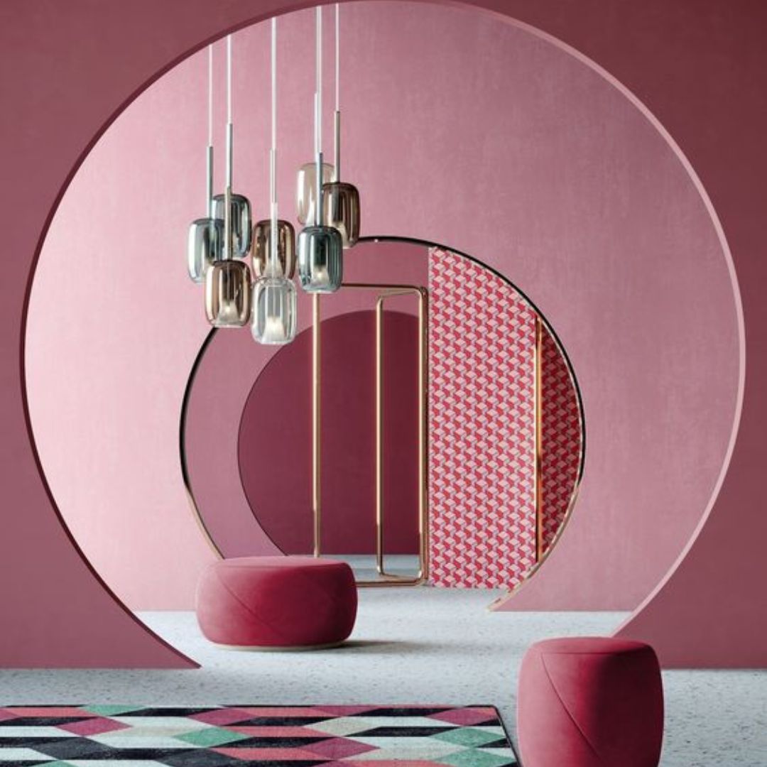
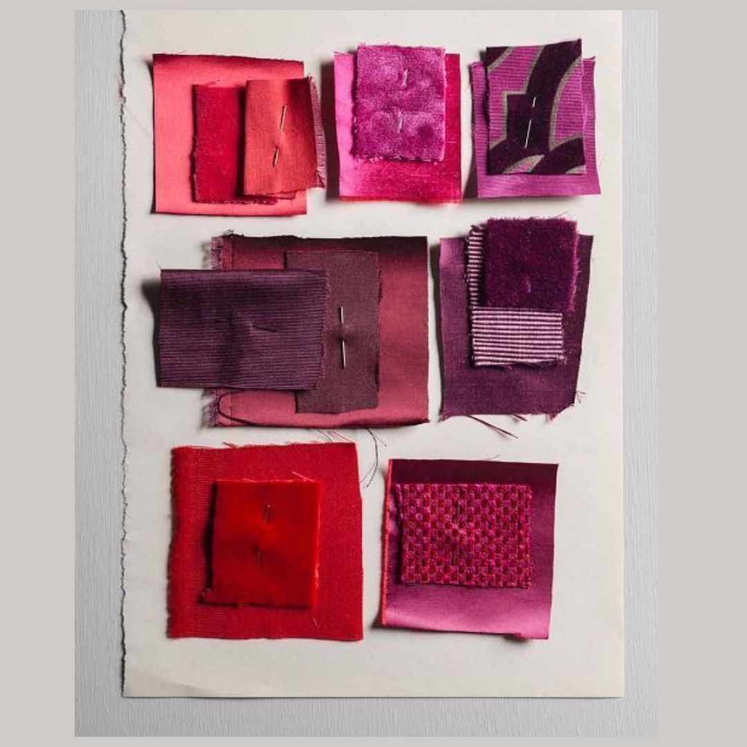
Rust and fig; claret, marsala and bordeau; blood orange, amber, or carrot orange can help deepen its richness.
Green and purple palettes can offer pleasant surprises. Pigments that are closer to the ‘midway’ mark work best with Viva Magenta.
If you feel lavender and sage are done to death, travel closer to amethyst, mauve, and periwinkle in the purple palette; and olive or lime and green apple in the green palette.
One way to channel old-world baroque without extra embellishments, would be to layer Viva Magenta with muted gold and champagne – be it in curtains and drapes, or cushions for sofa styling.
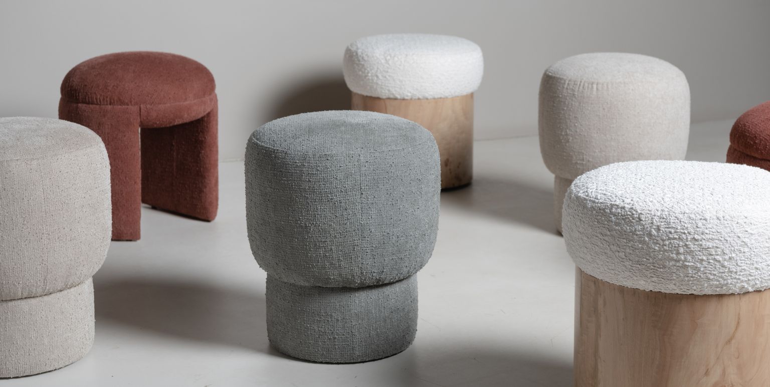
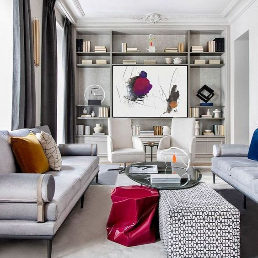
In terms of fabric texture, velvets and velvet blends would be a natural fit, while linens and bouclés can suggest a grittiness to the depth of the colour. Viva Magenta is also an excellent choice if you’re looking at rugs.
Viva Magenta accent chairs? Just that one in the room for eyeball-grab effect?
Sure! Viva Magenta would upholster well on wooden and metallic structures alike. Perhaps, the wood may have the darker finish, and the metallic option could be MS steel with a light, powdery finish.
It’s not something that immediately comes to mind, but Viva Magenta might really come into its own through tile patterns. It could be a backsplash in your kitchen, the wall of the bathroom cabinet, or tile work that doubles up as artwork in play rooms or TV rooms.